and a fireplace
 |
| source |
Contrasts are important in design.
New and old.
Hard and soft.
Dull and shiny.
Dark and light.
It is what makes a room unforgettable.
My husband recently refaced our fireplace. He installed small subway tiles around the opening and Carerra marble for the hearth. The door surround is a very dark grey with a hint of brown. The tiles looked whiter before install but after install look like a very pale grey which is why I chose the Carerra marble for the hearth. I am now at the point where I have to choose a paint color for the fireplace.

I am not sure if I should go with a light to medium grey or darker to make the subway tile and marble colors pop and tie in the color of the door. I am not sure if this would look too dark though. The other option is to paint the fireplace bright white. What colors would you suggest in either grey or white for the fireplace?

...I want to inject some color with an area rug, coffee table, pillows and curtains.... I do love robin's egg blue or maybe something a little brighter is needed to offset the beige. I do get quite a bit of light from the window in the photo during the day but the room gets quite dark at night since there are currently only two pot lights above the fireplace and a lamp in the back corner of the room. What are your thoughts about the robin's egg blue as an accent with the other colors?
My husband is going to build a smaller box around the t.v. to hide the wires on the side of the fireplace since there is a chimney in the back of the fireplace wall and he cannot run the wires through there.
Any help you can give is greatly appreciated
Thanks so much. Marcelle Santos
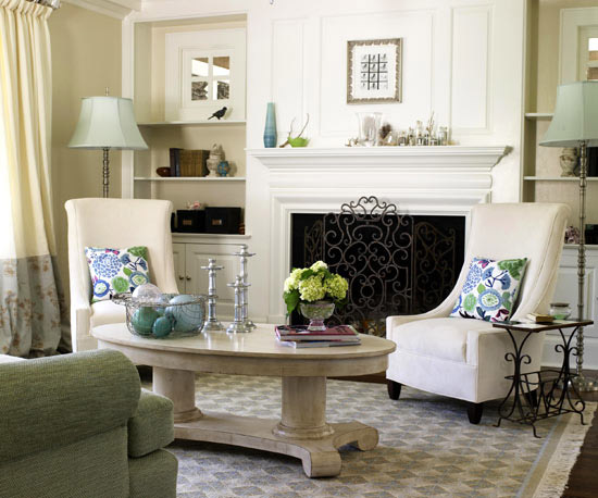
Marcelle, how nice to have a husband who is so handy at DIY! I do like the wall color. If it is close to Revere Pewter, it is beautiful. As for the fireplace, I feel that a medium dark to dark gray or charcoal would look best with the fireplace. When I look at the photo above I see two things: 1. All of your furniture and fabric is around the same color value (no extreme darks and lights) and 2. The tv and the fireplace opening are the first things you see.
 |
| Source |
 |
| BEHR Dark Granite |
 |
| BEHR Ashwood |
 |
| BEHR Fashion Gray |
 |
| BEHR Evening Hush |
 |
| BEHR Ashes |

or this...

You could even bring in your accent color as the background color for the bookcases.

You could even bring in your accent color as the background color for the bookcases.
 |
 |
| source |
As for an accent color - the robin's egg blue is one of my favorite colors, too.


Your main accent should be the color you most prefer, and bring in the secondary color/colors more sparingly.

Good luck!

Hi Claudine, What a wonderful site - I have already shared it with friends who have also become fans. I did not expect to write you, especially as I am almost done with my remodel - um - experience. Master bath/bedroom painted in BM Jet Stream blue (#814). Subway tiles in bathroom are Lowes white. Did not mind too much that contractor (nice man) took it upon himself to paint trim without consult,. He is using HD's "White". That's it. "White". ?? It is quite bright, just this side of stark. Turns bedroom too much into nursery. I do like a fresh, clean look, but it probably needs to be creamier? Yet, the white is not too bad in bathroom, also Jet Stream as backdrop to Lowes white subway tile. To use a creamy white in bath may look 'off'. Bathroom vanity will be painted same color as trim, which will be a whole lot of bright white. Any ideas are welcome. (hope it is OK I am hijacking this post - do not see how to submit otherwise). In any case - you do have a wonderful site!
ReplyDeleteThank you, Randy. So happy it has helped you and appreciate the sharing! BM White Dove is my favorite go to white. Not stark. Not yellow. Perfect. However, Jet Stream is a fairly bright pastel blue and its probably looking a little juvenile to you in the master. Bridge the gap between the blue and white with a soft gray, soft gray green, or a tan/beige in fabrics and accessories, (and if you can find a fabric pairing one of those colors and the blue, even better) and it won't be as noticeable. Do the same in the bathroom with towels, baskets, etc. and it will pull both rooms together. If you would like more specific help, you can send a photo to your-nest@hotmail.com
DeleteBest wishes!