
With the holiday season fast approaching, begining with all the little visitors you will have for Halloween, its a good time to take a minute to look at the front of your house, and particularly your front door area, to see if it says 'Welcome'
or 'Go Away'.

Yikes!
(Or in extreme cases "Yikes"
 or "a crazy person lives here" - hope you don't fall in that category!)

I recently had a friend ask me a question I thought would make a great subject for a blog post:
..."wish my front porch wasn't so sloping. . .with-an-ugly-white-front-door...ish. I can't . . .fix the porch yet, but maybe I could paint the front door, if that would help at all. What do you think would be a good color with the reddish brown brick and white trim?. . ."

Low contrast 'white' door - while it doesn't look bad, it doesn't exactly stand out or look warm and inviting...

Another low contrast door - it's hard to see where the house ends and the door starts
YELLOW AND MUSTARD

creamy yellow doors look best with lots of white trim around them

on a darker house

Mustard is strong enough to stand on its own. I must say, I am liking this mustard!

The second important thing is that it should look well cared for. Make sure the paint or stain is fresh, not peeling or faded.

this french style is a little faded

this could look amazing in a deep color, but looks weak in white

I like the color of this door, but there needs to be a bigger contrast to the house color
(Remember, this is the first impression people have of your home, and sometimes of you).
Polish that doorknob, and the porch light -
or replace them if they are beyond help.
or replace them if they are beyond help.
REDS

a bold red door shouts confidence and 'look at me'
can't miss the entrance here

the brass handle and kick plate are a traditional touch
that brightens an entrance

a glossy door and beautiful hardware make a good impression

with red brick and white trim - a red door looks just right
and I love the black threshhold and shutters


A new trend is vinyl lettering on doors
family names, street numbers and welcoming phrases are
easy to apply and an inexpensive decorative detail
you can order custom vinyl here

leenthegraphicqueen


Red door with white trim on a soft grey house - elegant!

A good example of the same door in different colors
Which color to you prefer?

Now this says 'welcome'!
Thirdly, add a little charm. Put a wreath on the door, or a few potted plants.
BLUE, TEAL, TURQUOISE

Blues are a little more tricky - but this one looks good against the red brick and white trim - and patriotic


classic blue and white
you can never go wrong with a classic

country blue

Turquoise is a strong color and looks best against cool neutrals - no red brick for this one

the reason the teal on this door looks wonderful is that it is a natural complementary color for the orange of the leaves, brick and pumpkins

A lighter colored door works when the house color is dark

this purple door is a richer, deeper shade of the brick of the house
the glossy finish is a nice contrast to the brick

A stone house can handle a white door
the contrast makes it pop against the stone


a grey toned stone is a great companion to turquoise


another favorite of mine is this beautiful charcoal grey


but I'd have to say my all time favorite is the classic glossy black door

which looks good on light grey houses, white houses and red brick houses
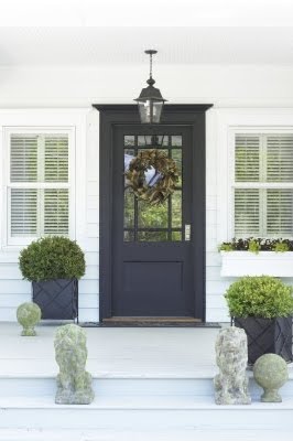


so, friend with the door query - your house would look clean and classic with a glossy black door, black porch light, and a brass kick plate. You could add a couple of potted rounded boxwood shrubs and a couple of other pots with flowering plants for a more welcoming look.
Red or mustard will look nice, too, if you want to go bold. (Plan on extra paint for red and yellow - they need several coats to cover well.)
TAKE A LONG OBJECTIVE LOOK AT YOUR FRONT ENTRANCE. IF IT DOESN'T SAY 'WELCOME' THEN GET SOME PAINT AND SPRUCE IT UP!


 The overall palette of brown, beige and white and the hard surfaces of the wood and marble left the area feeling empty and a little cold. We needed to warm things up a little. We found pillows with just the right combination of colors for the sofa and chairs and had textured carpeting cut to size and bound as a rug. Lisa liked things calm and not too busy, so didn't want an area rug with a lot of pattern. She also liked the open feeling of the room and elected not to add an ottoman or coffee table.
 The other end of the living room needed some fresh greenery and lighting.


 We found this great iron oversized basket and filled it with boxwood orbs. (Bringing that fresh green in again...) The chunky candles brought in more of the blue to this area. Tucked into the far corner is another apothecary, filled with oranges.


