Seems that we have been hit with an onslaught of slab leaks in our area.
Not sure if it is just that our homes are all reaching that age, or if there is some additive in the water
eating away at the copper pipes and causing pin holes...
but my dear friend and client, Alana, was the most recent victim.
Her beautiful hardwood floor was destroyed, and since it was nearly 10 years old,
matching it was going to be difficult.
She was able to find the same company
and they said they could match the stain...good news - the alternative was to replace all the flooring in the entire ground level of her home.
The bad news, however, was that in the efforts to find and repair the leak, the leak detection company managed to destroy some of her kitchen cabinets.
That would be harder to match, as that company was no longer in business.
About that time, they decided they didn't really like their kitchen cabinets and might like to replace them, since the kitchen was going to be torn apart anyway....

Sometimes disasters turn into daisies....
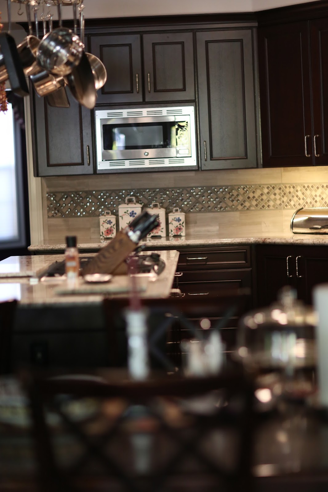
This is the result - all put back together and improved

with new solid mahogany cabinets and new countertops.


The backsplash was a custom mosaic, because try as we might, we could not find anything that Alana was really happy with in the ready-made department.

So, instead we selected the bits she did like, and I created a pattern for a custom mosaic. I think it turned out rather nice...

She really loved the granite she had in the old version of the kitchen (see sample on the edge of the counter here). It had also been the material on the backsplash.

With the dark floors, and dark cabinets, I really wanted to go lighter with counters and backsplash and I felt that would show off the beautiful wood with more of a contrast.

Happily she and her husband agreed and they chose this lovely piece of rock.

It breathes new life into this space

along with the limestone and mosaic backsplash


I did not want an electrical plug every 4 feet on that gorgeous new backsplash...
so all of our electrical plugs are up under the cabinets with the lighting.

Cabinets are by APlus Home Improvements who manufacture their own product.
They are of superior quality and beauty. Totally recommend them.




And that's how you turn a disaster into a daisy!
*********************************************************************
Hi Claudine -
I stumbled upon your website and absolutely love your style! Your blog posts are wonderful and very helpful. I have a question I have not seen come across your website yet, and it is in regard to white washed cabinets.
The previous owners of our house picked a variety of things that don’t seem to go together. We have white washed natural hickory cabinets (that have a pinkishness to them), a medium brown travertine tile backsplash, a green (peacock verde) countertop and a Brazilian cherry floor. We are planning on changing the counter and backsplash to a quartz that resembles marble (probably Cambria Ella or something else with minimal veining) to lighten up the whole space and calm it all down. We are at a loss as to what to do with the paint color to prevent the pink from coming out in the cabinets. The kitchen is VERY dark. It faces north and is in the middle of the house, with a covered porch behind it. We have an adjoining family room that has a wall of windows, so we can see light from the kitchen.
We currently have BM - Kona in the kitchen but it is very cave like in our dark space.

We love grays, but are not sure if they will help or hinder the pinkness. We have a large adjoining family room (facing North but with a wall of windows) that currently is - I believe BM - Shelburne Buff.

It’s a great color, but very GOLD looking and the gold is getting tiring. We are very open to changing that as well. I love your suggestions for keeping the walls lighter and letting the architecture and furniture stand out.

We love grays, but are not sure if they will help or hinder the pinkness. We have a large adjoining family room (facing North but with a wall of windows) that currently is - I believe BM - Shelburne Buff.

It’s a great color, but very GOLD looking and the gold is getting tiring. We are very open to changing that as well. I love your suggestions for keeping the walls lighter and letting the architecture and furniture stand out.
Any suggestions for what we can do to help this kitchen out?
Thanks -
Annie
So sorry Annie - that white wash is so decades ago, it will be hard to mask that look even with a different color. Best case scenario would be to paint those cabinets White Dove by Benjamin Moore - that would brighten it up in there - maybe even White Dove upper cabinets and a nice neutral medium gray on the bottom so that your new counters can stand out... and yes do remove that very dark brown as it can suck the light out of a room. In this case ('painting the cabinets best case scenario') I would try Edgecomb Gray on the walls, or Gray Owl, which are lighter, since you say its a bit of a cave. Check to see that you have adequate lighting, and that its not warm white, but nice task oriented bright cool light.


If the cabinets are staying as is, definitely neutralize around them. The softer white/gray countertops and backsplash can handle a little more defined color on the walls. Try Collingwood, too (Benjamin Moore) - or Shale (Benjamin Moore)
you will have to try some swatches to see what is best with the new counters. All these grays should go nicely with the flooring and with most other colors you are using. They will provide a soft background. Whatever color you use in the kitchen you can carry on to the adjoining room, which will make the space feel more cohesive.
Good Luck!
So sorry Annie - that white wash is so decades ago, it will be hard to mask that look even with a different color. Best case scenario would be to paint those cabinets White Dove by Benjamin Moore - that would brighten it up in there - maybe even White Dove upper cabinets and a nice neutral medium gray on the bottom so that your new counters can stand out... and yes do remove that very dark brown as it can suck the light out of a room. In this case ('painting the cabinets best case scenario') I would try Edgecomb Gray on the walls, or Gray Owl, which are lighter, since you say its a bit of a cave. Check to see that you have adequate lighting, and that its not warm white, but nice task oriented bright cool light.

Edgecomb Gray (Benjamin Moore)

Gray Owl (Benjamin Moore)
 |
| Collingwood (Benjamin Moore) |
 |
| Shale (Benjamin Moore) |
Good Luck!