BUCKSKIN... WARM TAN
3/2/13
CREATING MAGIC WITH TAN
2/23/13
A GRAY HORSE
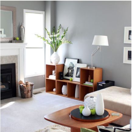
Benjamin Moore's paint color, Gray Horse, is a light gray with a slight green undertone. It is on my 'lovely colors' list. [I really must get around to blogging about them some day soon.]
Labels:
benjamin moore,
bm,
gray,
gray horse,
grays,
paint color,
palette,
pashmina
2/17/13
STONE HOUSE COLOR PALETTE
BRIDGING THE GAP
Interior Decorating is primarily about color. Color that defines a space, color that accents a space, color to create a mood, color to enhance architectural details, color to create interest, color for contrast. Color to create flow from room to room and make sense of it all.... to bridge the gap so to speak...
1/24/13
UNDERSTANDING UNDERTONES
Labels:
beige gray,
benjamin moore,
blue gray,
gray,
gray green,
greige,
grey,
neutrals,
paint,
silver,
undertone,
wall color
12/20/12
CHOOSING PAINT COLOR FOR A BEACH HOUSE
ABOUT THE BEACH LOOK
A beach house needs to be comfortable and easy care, impervious to sand and salt water, with soft and calm colors. The view outside needs to take precedence over the view inside. That means distressed wood, stone, weathered paint finishes, easy care slipcovers, painted fresh white woodwork, and the muted colors of sand, sea, driftwood, sea glass, and shells. Toss in the cry of gulls, sound of surf and ocean breeze and a porch or patio to take it all in - and you have HEAVEN.
Subscribe to:
Posts (Atom)