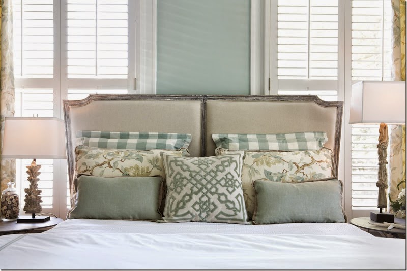
That's a loaded question...
 |
| via |
and with all the paint color possibilities out there
[thousands]
you are not going to want to hear my answer...
 |
| via |
I. DON'T. KNOW.
Selecting a color you want to live with day in and day out
is a very personal choice
 |
| via |
and I don't know you
yet.
BUT I CAN HELP YOU DISCOVER THOSE COLORS
if you give me some good information,
some photos of your space
and possibly some photos of the rooms you love.
 |
| via |
DON'T WORRY ABOUT A COLOR FOR EVERY ROOM,
your home will do just fine with just 3-4 colors
[more or less depending on size].
 |
| via BM Pleasant Valley Blue |
Too many color changes can make your eye stop and start
which makes your home feel smaller
because you are seeing individual spaces instead of an overall flow -
especially if you have a more open floor plan.
 |
| via |
Don't be hesitant to reuse colors throughout your home,
it creates a color and design flow that is good to have
USE SOFT NEUTRAL TONES
Why neutrals?
Because they last.
Because they are a good background.
Because they STAY in the background.
Because they go with so many many other colors.
Because they don't take over the room.
Because your furniture and art look awesome with them.
Because they are more livable.
 |
| via |
WHAT IS A NEUTRAL?
Nearly every color can be a neutral.
I call it 'graying it down'.
Basically, its the muddied or gray version of that color.
A softer, more soothing version.
For blue, its a gray blue version of every hue.
Some are gray with a blue undertone.
For green, a grayed green.
 |
| via |
Browns and beiges go softer into gray beige and taupes.
Purple gets muddied and softer.
Some colors are already neutral - of course
but it doesn't have to be limited to beige, tan and gray.
TRY BEFORE YOU BUY
You simply MUST try the samples in the actual rooms
Why, you say?
 |
| via Pinterest |
Your home's light,
its ceiling height,
its room size,
the flooring,
the number of windows,
the direction the room faces,
the current color on the walls..
all will affect paint color.
 |
| via |
What looks perfectly lovely in a photo of someone else's home,
or on the paint swatch at the paint store,
can look completely different in your space.
So, buy a sample of the paint,
and some poster board,
paint one coat and let it dry,
(leaving a good margin of white around the edges)
then paint another coat - just like you would on your walls.
 |
| via |
When it is dry, thumbtack it to your wall
and observe the color throughout the day.
Move it around,
see how it changes, and how it looks in natural and manufactured light.
If you love it
BUY IT!
AND PUT IT ON YOUR WALLS!
 |
| via |
HERE ARE SOME BEAUTIFUL, LIVABLE, LOVELY
NEUTRAL COLORS TO CONSIDER
 |
| AGANTHUS GREEN Benjamin Moore |
 |
| BRANDON BEIGE Benjamin Moore |
 |
| GRAY WISP Benjamin Moore |
 |
| GRANITE GRAY Glidden Paints |
 |
| MAGNETIC GRAY Sherwin Williams |
 |
| MUSHROOM Sherwin Williams via |
 |
| SEA SALT Sherwin Williams via |
 |
| SVELTE SAGE Sherwin Williams via |
 |
| MOONSHINE Benjamin Moore via |
 |
| THUNDER Benjamin Moore via |
 |
| BOOTHBAY GRAY Benjamin Moore |
 |
| CAMOUFLAGE Benjamin Moore via |
 |
| CAROLINA GULL Benjamin Moore |
 |
| DRY SAGE Benjamin Moore |
 |
| GRASSLAND Sherwin Williams |
 |
| GRAY CASHMERE Benjamin Moore |
 |
| GRAY HORSE Benjamin Moore via |
 |
| NORTHERN CLIFFS Benjamin Moore |
 |
| PALE SMOKE Benjamin Moore via |
 |
| PASHMINA Benjamin Moore |
 |
| SEAFOAM STORM Valspar via |
 |
| SEATTLE MIST Benjamin Moore |
*********************************************************************************
QUESTION FROM A READER:
Hi There,
We are looking at updating our home using the gray palette. I want to use grays that have green or brown undertones and I really do not want the blue; however, if I have to have an undertone I would go with the blue. I have read you recommended to use three colors throughout the home. How exactly do I go about doing that?
Our master bedroom is rather large. I would like to accent the wall that the bed is on with a dark color like graphite and graphite may be too dark. I would appreciate color ideas on guest bedrooms, dining room, living area, entry, daughter's bedroom and hallway. I want to create a modern looking home. I would greatly appreciate any advice you can give to me.
Thanks so much!
Charlotte
Dear Charlotte,
Choosing a color palette for your home requires a little homework. For example, what are the permanent surfaces like - tile? wood? carpet?... The colors on your permanent surfaces will help determine what colors to use because they will have to coordinate with those surfaces. Do you have existing furniture you need to consider? Once you have that squared away, go to your neutrals in the paint colors swatches and pull out a few that appeal to you. Hold them next to the permanent surfaces to see if they blend well. Do the same with the furnishings that will remain in the room. Choose 3-4 that look good together and that look good with your permanent surfaces and furniture, and you will be well on your way. Neutrals are easier because they go with nearly everything.
I can suggest a color for your bedroom, but if you want help with the other rooms in your home, you can email me privately for a quote on a color consultation. Unfortunately, I am only able to answer one question in this format. I'm including a photograph of a room where I did a graphite accent wall and I think it turned out rather beautifully. The color I used is Dunn Edwards/California Paints LEGENDARY GRAY.
 |
| www.yournestdesign.blogspot.com |
Good Luck