
Gray.
Bleak.
Gray Day. Stormy Gray. Misty Gray.
Cement Gray. Concrete Gray.
Gray Hairs. Cold Gray. Plain Gray.
You're looking a little Gray.
Old and Gray.
Gray Matter. Gray Area. Gray Cloud.
Gray seldom has positive connotations.
Bleak.
Gray Day. Stormy Gray. Misty Gray.
Cement Gray. Concrete Gray.
Gray Hairs. Cold Gray. Plain Gray.
You're looking a little Gray.
Old and Gray.
Gray Matter. Gray Area. Gray Cloud.
Gray seldom has positive connotations.
Gray alone can be cold, hard, unemotional, sterile.
Kind of like concrete.
Or Rocks.
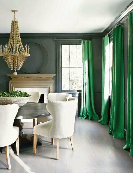
And yet, it is currently the most loved color in home decorating
And yet, it is currently the most loved color in home decorating

Not very pretty, is it?
Gray carries a negative connotation
and yet, today, it is one of the most popular colors in decorating.
I think gray is beautiful because of the undertone colors.
and in the cases where there isn't a visible undertone,
because of the colors and textures used with it.
A grayed down color of nearly anything is more soothing and more livable.
So I'm a little surprised when I get requests for help finding a gray without a visible undertone.
Seriously? You want your room to look like cement?

More often, it is just fear speaking.
We are a little afraid of 'undertones'
Its a word we don't always understand.

Why can't we see them?
Why do they wait until they are on our walls to rear their heads and ruin our decorating plan?
What is an undertone, anyway?

Well, don't you worry your little head about them.
Undertones are just color.
If you add black to a color, you get a gray version of that color.
I know that is a little simplistic, there is more involved than just dumping in some black,
but basically, you start with color.

Adding the black and muting it makes it more neutral
If you like the color in its truly neutral form
it will go with just about anything

Which is another reason people love gray.
It is so versatile.
It plays so nicely with so many many other colors


So here are a couple of tricks to make you like gray even more.

To keep it beautiful, fresh and not depressing - add white


White moldings,
white furnishings,

white accents... you choose.

Look at all those beautiful decorator rooms and notice how they use white

Add warmth - wood tones in furniture, flooring, baskets, etc.

Add color - soft color to soothe,

bright color to invigorate

Add a little black - for drama.
Sometimes, though, a gray without obvious undertones is necessary.
I received this question from a reader - looking for a true gray:
Hi Claudine,
I love your website! You are so generous to share such a wealth of information with your readers. We are moving and want to have a gray color scheme on the walls in our new home. We're hoping to use 2-3 different gray wall colors throughout the home to provide some visual interest but that will also create a nice flow. (Our accent color through accessories will range from light aqua to a fun punch of bright turquoise.)

The problem is that I cannot find a gray color that does not turn green/yellow/warm/muddy in the home's lighting. I really want true gray colors with no warm/greige undertones. I also don't want anything that will read blue, though. It's a small house that is a bit dark, so I think we should stick to light-grays with maybe one room being a medium-gray.

The trim throughout the house is off-white and, although bright white trim would probably look better, I don't think we'll be repainting the trim anytime soon. The hardwood floors throughout the home are a medium oak tone.

Can you recommend a few Benjamin Moore gray paint colors to try that would all flow nicely together and that won't turn warm?

Thank you!
Anonymous
Thank you for your kind words. I'm so happy you are enjoying the blog. To find a true gray without undertones we need to look at the Benjamin Moore charts. I pulled the two that are the most neutral gray - with as little undertone as I could find. The first three columns in the chart below are a good choice. Very little undertone in these colors, as you can see in the mid to dark range of the chart. By the 4th column, things are getting a blue undertone, and by the 5th column there is a little green in the mix.

Another possibility is allowing a beige/brown undertone.
It will be just a softer more soothing gray, and one you may actually like.
It will give you a little variety in your color palette.
The middle column below is pretty close to no undertone. To the right, a little beige/brown is in that column. I like the Pigeon Gray for its softness.

The final proof will be in the samples you put up on the wall in your difficult light.
So, choose a few of these to try and find the ones that look the most neutral to you.
Good luck!

I have given up trying to find a gray with a turquoise undertone. The grays with blue undertones looking too baby-boy blue for my taste. The ones with green undertones look too light olive green for my tastes. I've tried the 'greige's and have the same problem. Any suggestions? I'm getting poor just from excessive quart-test size purchases. :(
ReplyDeleteInformative article, although it sounds like the author is not a fan of grays without undertones.
ReplyDeleteAnonymous
ReplyDeleteActually, I don't have a preference- it depends on personal decor, light and style. However I was hoping to make the point that gray is created from colors and there are very very few options without undertones, and not all of them are in your face with their undertones - some are very subtle and beautiful.
From Living Room furniture's up to the best home decorations, you featured it all! even the interiors of the home featured makes me adore you.
ReplyDelete