I SO ENJOY YOUR COMMENTS! A FEW OF YOU HAD QUESTIONS REGARDING PAINT AND WALL COLORS RECENTLY SO I'M TAKING THIS OPPORTUNITY TO ANSWER YOUR QUESTIONS......

Since we are talking paint - just a few reminders... I have not seen your space, so you are the best judge of your lighting, size and shape of your room and adjacent areas.
Remember, with lower ceilings and smaller spaces wall color is intensified. Never put color on a wall without first testing it in your light - both morning and evening - to see how it looks in natural and incandescant lighting. Best way to do that: a couple coats of paint on a poster board with a 2" margin of white around it so that your current wall color doesn't interfere. Tape it to the wall, move it around and experience it for a full day before making your decision.
 |
| Benjamin Moore [Hush] |
 |
| Benjamin Moore [Iced Marble] |
QUESTION #1
hi. if you can please help me..I have light pink/peachy looking painted kitchen cabinets,.the sink, counter top ,back splash are black..now the walls are a boring beige..I want to go for a neutrel light gray..my landlord wont allow me to repaint the cabinets. what can I do..my kitchen opens up to my living room..which has black leather sofas,dark wood tables..light gold draperies and pillow..I also want to paint the living room same tone as kitchen..Please advise me..am planning to do this very soon..thank u much.AD ...I forgot to mention the floor in my kitchen is a mix of light and dark gray..and so is my living rm..but it tends to look white from far away..thanks again..AD Dear AD:
There are two choices that come to mind when looking for a color that goes with both pink/peach and light gold - chocolate and gray. Without seeing the actual cabinets and draperies, I can't make a complete recommendation, but here are some photos to illustrate how chocolate and gray interact with peach/pink and gold:
 |
| Chocolate with gold accents |
 |
| chocolate and pink/peach accents |
 |
| gray and pink/peach |
 |
| dark gray/pink peach |
 |
| gray/pink peach |
 |
| gray/gold |
 |
| gray/gold |
 |
| dark gray/pink |
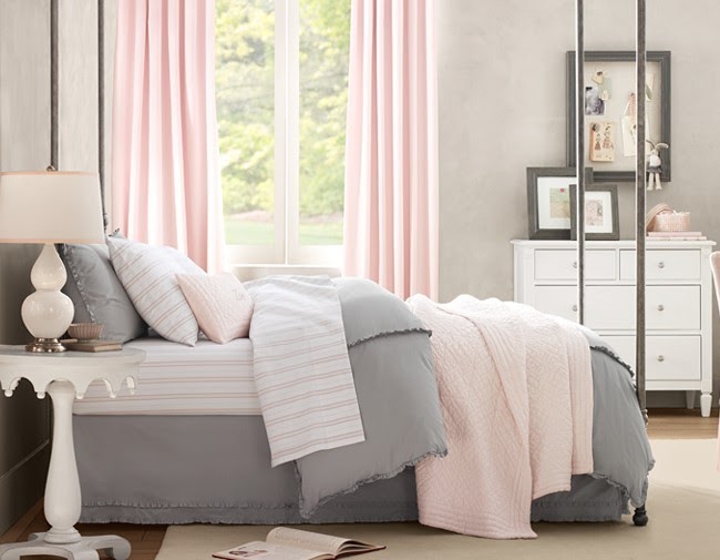 |
| light gray/pink |


Good luck! Please let us know how it turns out!
QUESTION #2
Stumbled upon your blog...your selected photos and advice seem spot on! I'm in desperate need of help. Recently moved into our home and in my haste, I rushed when picking paint colors...painted BM Thunder (cool?) in the dining room and BM Stonehouse (warm?) in the living room which is across the hall (our house is a Cape built in 1966). Now, I can't figure out a color to paint the entry/stairway area that works with both the dining and living room colors. Any suggestions? My husband is tired of listening to my angst!Dear Anonymous,
One suggestion would be the color combination below. The first color representing Stone House (although not exact), the middle representing Thunder (also not exact - see swatches below). You can see that a light and mid tone grayed down blue works very well with both colors


 |
| Benjamin Moore [Nightingale] Pottery Barn |
 |
| Benjamin Moore [Winter Solstice] |
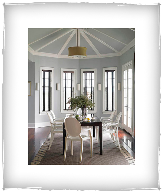
Benjamin Moore has many gray blue hues to choose from - take your pick. Select a couple, get tester pots, and try them in the area (a poster board painted with two coats of color can be taped to the wall in view of the other areas to get an idea of how they will look together).
 |
| Benjamin Moore Grays and Blue Grays |
 |
| Benjamin Moore [Beach Glass] |
A grayed down blue/green would look lovely as well.
 |
| Benjamin Moore [Silver Cloud] Sarah Richardson |
 |
| Sherwin Williams [Hazel] |
 |
| Sherwin Williams [Halcyon Green] |

 |
| Benjamin Moore [Clay Beige] |
 |
| Benjamin Moore [Papaya] |
Best of luck. !
QUESTION #3
I loved all the pics. We just re-did our kitchen with cream cabinets. Our family room which is attached has beige furniture. our floors are medium brown oak floors. Black island and hutch. Please help with wall paint color. I was thinking Willow Creek BM color? Kim
 |
| Benjamin Moore [Willow Creek] |
With such a neutral palette, you could really go anywhere with color. I don't know how large your rooms are or how high the ceilings are, but I do love Willow Creek. Color can intensify in smaller spaces and with lower ceilings, and Willow Creek can get a little dark in those instances, so here are some alternatives to consider, as well, in the greige family (gray/beige).
 |
| Classic Gray |
 |
| Clay Beige |
 |
Benjamin Moore [Grant Beige]
|
 |
| Benjamin Moore [Grant Beige] (Notice how this color changes with lighting) |
 |
| Valspar [Autumn Fog]; Behr [Flint Smoke] Benjamin Moore [Silver Gray] Centsational Girl |
 |
| Behr [Dolphin Fin] |
 |
Benjamin Moore [Revere Pewter]
|
QUESTION #4
I came across your blog while looking for ideas for our basement. Absolutely love your taste and the pictures you post. I would like your help please. We are adding a bedroom in our basement. That room will have a window, but the window looks under the deck and definitely doesn't get a lot of light. Would you please suggest a color that would make this room feel bright and cheerful and still be a neutral color? The rest of the basement is all in the off white - beige pallet. I would really appreciate your advice. Thank you. N.E.
Dear N.E.
To keep a darker room feeling light and bright, stay away from too much pigment in your paint colors... A bright sunny very yellow paint - one might think would brighten a space, but can be overwhelming and heavy in a darker area. As far a neutrals go, nearly every color has a neutral if you take it grayed down and light enough. So here are a few for you to think about:
 |
| Benjamin Moore [Dune Grass] |
A neutral but with a good amount of 'light' to it.
 |
| Benjamin Moore [Seashell] |
Lovely cream - just a touch of color
 |
| Benjamin Moore [Soleil] |
Creamy gold
 |
| Benjamin Moore 'Whites' Technically these are 'white' colors, but have just a touch of color and will read as a soft color in a darker area. |
One of my favorites paler colors is Papaya, which looks like Vanilla Ice Cream
with a little caramel in it.
 |
| Benjamin Moore [Papaya]
Remember, all of these colors will intensify in a darker and lower ceilinged spot - so put some tests on your walls to see how the color looks in the actual space. Another way to dispell the gloom of a basement area is to make sure you have adequate lighting - both overhead and task lighting in the form of floor and table lamps.
|
QUESTION #5
Beautiful pictures! I am curious as to where to find the bedding in the March 2010 issue of Traditional home where you talked about the burnt orange and pumpkin warming up grey. Any ideas? Also - great playlist! - Stacey

Dear Stacey,
Thanks! Unfortunately, I don't know where or if you can purchase the bedding pictured above (did I get the right one?). It is probably custom made. It would be simple enough to duplicate - provided you can find a fabric that is similar (actually two - see sheet edge and bedskirt) A plain white duvet is trimmed with a satin ribbon matching the fabric - (that is simple enough to embellish a premade white duvet.) Shams are made from the larger patterned fabric and dust ruffle from the smaller. A plain white sheet set is trimmed in 5 inches of the smaller patterned fabric (make sure it is washable, and wash it before sewing onto the flat sheet.) I've listed links to some how-to instructions on creating your own shams and bedskirt! If you don't sew, perhaps you have a friend or family member who does??? Good Luck!
QUESTION #6
 |
| Benjamin Moore [Thunder] |
BM Thunder...I'm considering this color for my whole house. As I want a gray with a little warmth. Do you think this color is too cold looking? Does it have purple undertones? It's hard to tell off of a board?
 |
| Martha Stewart [Flagstone] |
 |
| Benjamin Moore [Stonington Gray] |
 |
| Benjamin Moore [Stonington Gray] |

The easiest way to tell what the undertone is to a certain gray, is to follow that color to its darkest hue (top color) - it will clearly read green, brown, purple, blue or gray.

