I just returned from working with clients in St. George, Utah.

ST. GEORGE, was always a town we 'passed through'
or stopped to gas up on the way from California to visit family in Salt Lake.
I am not a fan of the desert,
but our glimpse of the town was limited to the gas station with the easiest freeway access.
Mostly it was hot.
Like a furnace.
But Spring in St. George is a pleasant surprise
A few thunder showers in the distance introduced banks of clouds to an otherwise endless blue sky
I have to admit
this place is growing on me

still not a big fan of the desert heat and air, but this particular desert
with its red cliffs and distant purple mountains

is kind of gorgeous
No drab desert browns here
brilliant red rock against fresh green trees and shrubs
are the perfect compliment
(red and green being complementary colors)
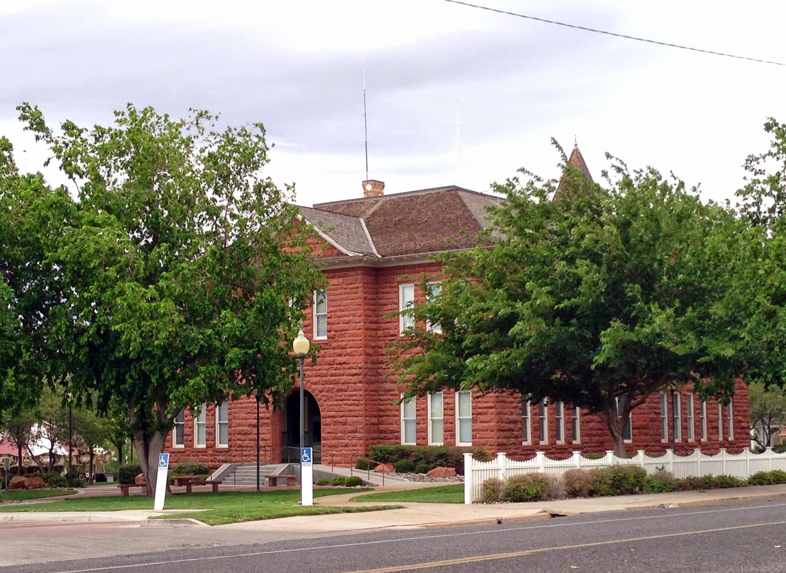
Early Sunday morning on my way out of town, I visited a few historic spots.
 early pioneer buildings
some were crafted of the red rock that gives this area its name - Color Country

St. George Tabernacle

Even though St. George is growing at leaps and bounds
it still has that small town feel

I practically had the sleepy town to myself

Pioneer Courthouse
Standing in pure white, against a gray sky
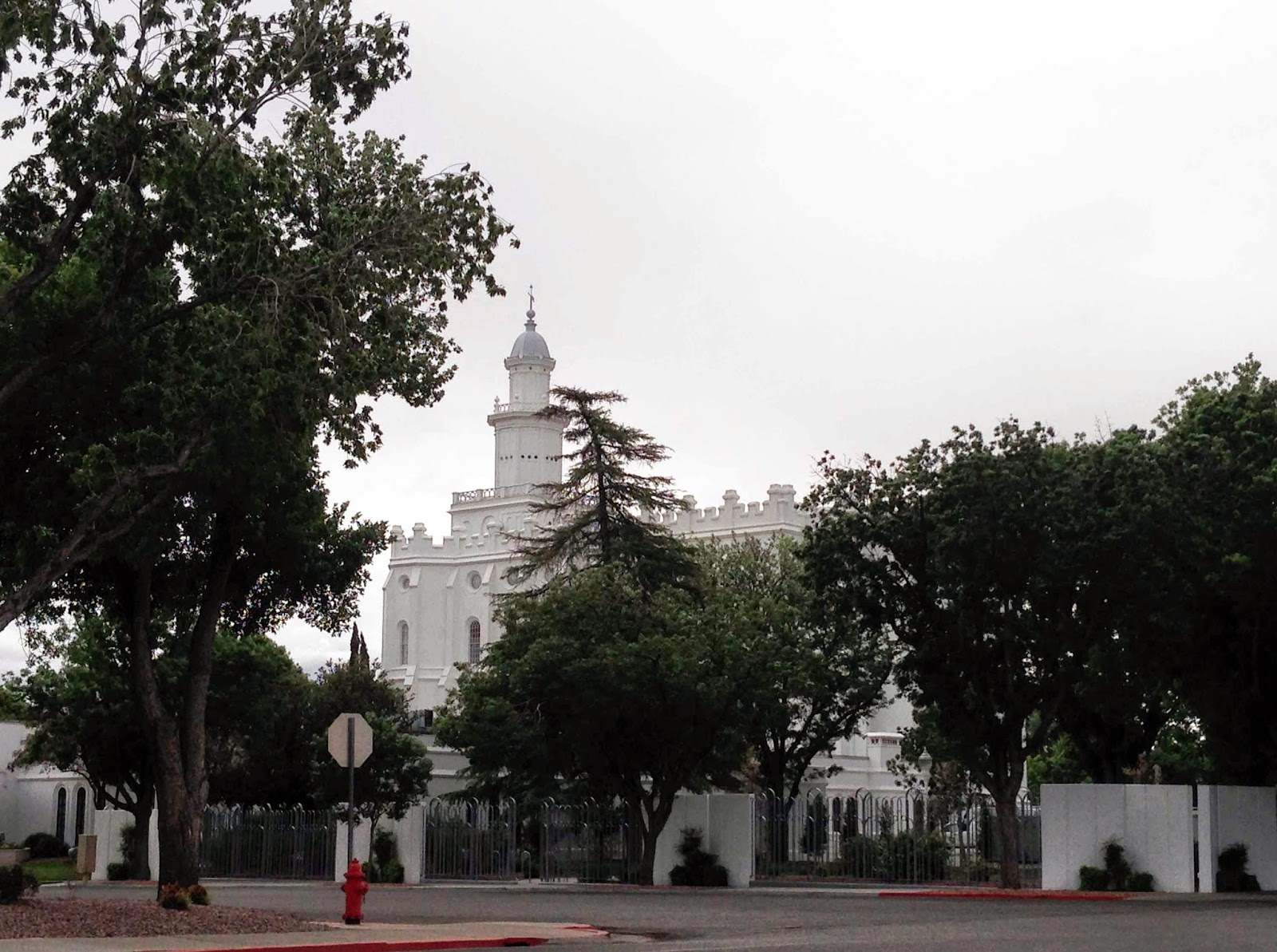
the St. George Temple was beautiful and serene,

quiet majesty


There is a traffic circle in the middle of this historic district with this sculpture smack dab in the middle
Kind of funky, next to the red rock pioneer buildings

this picture is for you, James - son of mine -

I knew you would
like it...
Working away from home is a little lonely, but I do enjoy
exploring a new place, so....
I explored Urban Renewal, a consignment shop in the heart of town
funky and fun with a lot of vintage charm


that crock on the top shelf had to come home with me....

liked this bold red bookcase...

and this mid-century style sectional
and LOVE the barnwood wall...
Definitely going to be one of my regular stops...
that and the gas station...
QUESTION FROM A READER:
Hi. I am trying to choose an interior paint color to go with Florim's
Ethos gray floor tile. My painter uses Dunn Edwards. I am torn between
Cloud (DEC 791) and Porpoise(DE6373). I have 10 foot ceilings with crown
molding and want a lighter warm gray. I am told that colors are lighter
when painted on a larger area versus looking at a 1x1 foot sample on wall?
Any ideas?
Liz.Masella@discounttire.com
 |
| Dunn Edwards PORPOISE |
 |
| Dunn Edwards CLOUD |
Hi Liz;
Oh how I envy your 10 foot ceilings. I see that your porcelain tile does have a little sprinkling of brown in it, and I agree that a warm gray would probably work well with it. I don't particularly see Cloud or Porpoise as being warm grays. Warm grays tend to have an undertone of beige or brown.
 |
| Dunn Edwards FINE GRAIN |


Dunn Edwards FINE GRAIN
One of my favorites is FINE GRAIN. It has a warm undertone and picks up those tones in your floor tile.
Of course, the proof is in the pudding - you need to try a swatch on poster board with a good 2" white border around it (two coats of the color, please don't skimp) to see how it will look in your room.
Best wishes!

No comments:
Post a Comment
Highly intelligent comments from amazing readers...