Showing posts with label gray undertone. Show all posts

5/28/15

SMALL WORLD - DIY TERRARIUMS

BIG IMPACT...

I have lately been exploring the world of the terrarium - 
It would be the perfect thing to put near my kitchen window.
They bring nature and the garden right to your face - and they are beautiful!

First I wanted to know if I could keep them alive...
I'm the Great Houseplant Killer in my family...
Don't leave one in my care.  
Ever.

Refinery 29
They do seem easy to care for, requiring only sporadic, minimal water 
as they create their own little microclimate in their container
and the glass (especially if it has a lid) creates a greenhouse effect.

Pinterest
They need bright indirect light, but not direct sunlight as that, combined with the glass container, 
would fry them quickly.
Flickr
My kitchen window looks out onto a covered patio - no direct sun - the perfect spot.
Instructables
I have plenty of glass containers to try, but not all have lids, 

and a lid seems to allow more control of the terrarium environment.
weegreenspot
If the glass fogs up a little and there is too much moisture - 
Flickr
removing the lid for a minute or two can correct it.  

Centro Garden
Put it back on when the fog is gone and it prevents further evaporation 
making it possible to go for long periods without adding moisture.


Then I saw these solutions for containers without lids...
Flickr
Glass orb... great idea!
Zest it Up
wooden disk with a knob -
problem solved!

Better Homes and Gardens
Here's a link from Better Homes and Gardens on how to make them 
and a tutorial from Martha Stewart...if you'd like to join me in this experiment. 

For more beautiful inspiration, here's a link to my Pinterest board Terrariums and Topiaries.

If you have tried these small world gardens with success, I would love to hear about it!


QUESTION FROM A READER

Hi there,
I have oak kitchen cabinets in a kitchen/ dining room in one.  The dining room table and hutch are oak as well.  I need a suggestion for a paint colour to bring out the set.  The oak isn't really light, yet not too dark.  I have lots of light coming in from dining area.  Can you suggest a colour for the walls and drapery?  It is painted a sage green and I would like to make a change.  The trim is white and I want to leave the trim the same  ( counter top has different brown in it)  I look forward to hearing from you

Regards,
Carol | 

Hi Carol,

To bring out a warm color - go the polar opposite.  Try a cool gray toned color.  For example, the opposite on the color wheel to red, is green.  The opposite of orange, is blue.  The opposite of yellow, is purple.  Red, orange and yellow are warm colors, and their opposites, or the colors that bring out their best, are cool colors (green, blue and purple).  You have lived with green for a while and want a change, so I would try a gray with a blue or purple undertone to bring out the warm tones of your wood.  


You can go gray and try these with a blue or purple undertone.

BM Abalone (Purple)

BM Pebble Beach (Blue)

BM Rockport Gray (smidge of Purple)

BM Eternity (Blue)
BM Sandlot Gray (Purple)
BM Wet Concrete (Purple)

Or you can go color and try these with a gray undertone.


BM Pleasant Valley

BM Slate Blue


BM Mauve Desert


BM Victorian Mauve

GOOD LUCK!


12/18/14

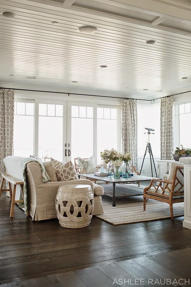
IT STARTS WITH COLOR

 CASUAL LIVING
there is an art to it
there is skill involved in making a home comfy, casual, comfortable

and still beautiful

because there isn't one of you out there who secretly wishes for an unattractive home

it starts with color
and restraint
color is great - especially when you know the colors you love
or the colors that make you feel good
or the colors you prefer to wear


Before you choose the wall color, you should have a good idea
of the other colors you want to live with...


take some time on this
you will be living with them for quite a few years...

Start with color..
but there is no need to hit someone over the head with it
the minute they walk in your door

Decorating is all about layers - and I like to start those layers with subtlety -
with background color -

something a little more quiet
that adds to the overall design but doesn't wave flags at you and say

"Hey, Look At Me!  I'm the Wall Color!!!"

Color is tied to our heartstrings...
and because color is emotional
choose it carefully
decide the atmosphere you want in your home...

if you want easy care, 
the kind of room you can put your feet up and relax
nothing fussy
then choose colors that make you feel comfortable and relaxed


if you like a soothing, calm, spacious, comfortable feel to a room
choose a grayed down color
a gray, a blue or green or beige with gray undertones
soft
soothing
tranquil

If  you prefer fresh, spacious and uncluttered -
clean lines, bright rooms -

find a white, or the barest whisper of a color
for your walls


If you like cozy,
go with warm tones

they tend to move toward you - making a room feel warmer, 

cozier and comfy


Something a little more dramatic appeal?
Use high contrasts,
deep colors

or accent walls


It all starts with wall color - 
and wall color starts with a plan in mind...
but that's another post for another day...

**********************************************************************

QUESTION FROM A READER:

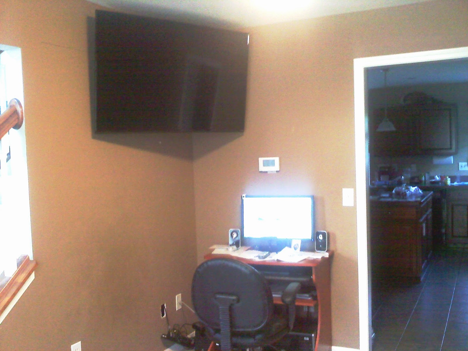
You'll see by these photos that this room needs help. It was supposed to be a formal dining room but we're not formal people. 
We just won and mounted the TV. It's up high to allow room for the computer. I thought of spraying the computer stand black? 

The piano is going away to make space for a new couch. Have not picked out a couch yet. Would like something that people would want to curl up on and watch a movie.

I would like suggestions on wall color, couch style, and anything else. Budget is nominal. I'm not a fan of gray because it feels rather cold to me. I did see a Benjamin Moore Van Courtland Blue that appealed. I've also see a happy Robin's egg blue (but paler, not intense) on a site somewhere. It was R.E.Blue on the top half and white on the bottom half, set off by burlap, full-length curtains and a white couch. We have three kids so the color white is a no-go. The rest of the house is soft-contemporary. This room is the first room people see when entering from the foyer so I don't want to go crazy with a teal ceiling (although I thought one was cool that I saw). Thanks for your help and I hope your mom & sister are doing okay.
Thank you for your kind wishes... sadly my mom passed away at nearly 97 - after living a long and full life.  My sister is still struggling with her illness.  Good days and bad.  Life in a nutshell. :)


The warm tan on your walls has too much warm tone for its size.  Warm tones tend to move toward you - making your room 'feel' smaller.  So I would recommend a cool tone neutral and then warm it up with fabrics and accessories.


Not all grays are cold.  The most popular gray tones actually have a beige or brown undertone, making them 'warm grays'.  Whatever color you decide on, I would recommend choosing a tone of that color that is 'grayed down' - or is the gray version of that color
having that gray base makes is a cooler and more soothing tone, 
and also makes the room feel larger

Benjamin Moore's Van Courtland Blue has a definite gray undertone
but may be a little too dark for your space - we don't want it to feel cave-like...

Benjamin Moore VAN COURTLAND BLUE

Here are some blue grays to consider...
I hope you find one you fall in love with!
Benjamin Moore PALADIAN BLUE
Benjamin Moore QUIET MOMENTS
Benjamin Moore BEACH GLASS
Benjamin Moore SILVER GRAY
Best of luck!


WHAT DID YOU MISS?

link within

Related Posts Plugin for WordPress, Blogger...