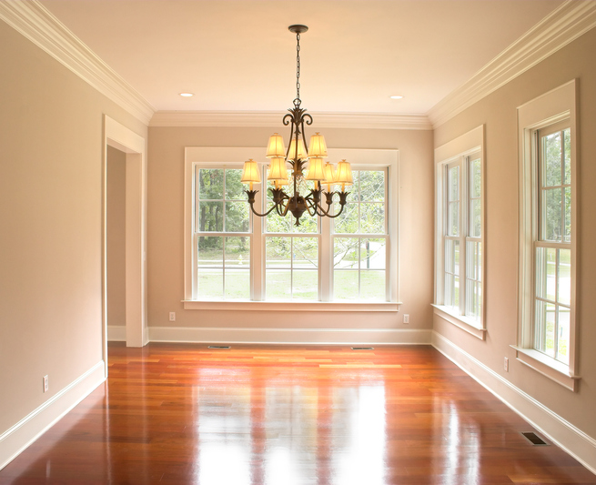
One of the projects I have been working on this season is my own home office. It is desperately in need of a remodel. Currently a chaotic overstuffed hoarder zone, I want an open uncluttered space - difficult when you need a large desk, desktop computer, professional printer, regular printer, paper, books and magazines, files, samples, paint fans, client seating, fabric and endless supplies, in the space the size of a small bedroom, (which is in actuality - a small bedroom). No matter how I rearranged the furniture in my head, it ended up boxy, crowded and uninspiring. (boring)
I needed open.
I needed calm.
I needed uncrowded.
And I wanted it to actually look good, too.
It is [supposed to be] a very creative place.
Obviously, I needed new furniture. (its a dirty job, but someone has to do it...)
I found the inspiration I needed while Ziggy was getting his annual checkup. As I waited in the vet's office, I thumbed through an issue of Better Homes and Gardens, and found the perfect fix for my cluttered office.
I was so excited, I didn't feel a bit guilty about tearing the pages out of the magazine and stashing them into my handbag while the receptionist wasn't looking. Just kidding. Actually, the receptionist was way too vigilant (how do you tear pages from a magazine quietly anyway?) and I ended up finding the room online here. This is Donna Talley's home office.

Here's what I loved about this room. The open shelving allows you to organize and decorate at the same time. The round table/desk makes the room feel less confined, more open, non 'office' looking seating is cozier less institutional, drapes soften and feminize the room. There is an overall open fresh feel. A rug brings color and pattern to that area as well.
It is not boring.
I knew I could get the cubby shelving from Ikea and the rest I went on the hunt to find. Craigslist (after a few weeks of looking) was where I found the almost exact same table/desk - an antique pine flip top table that can be a full round or a half-round. Perfect if I have a project where I need extra room.

I found and purchased tufted linen chairs at Restoration Hardware for my client seating and I'm still looking for a desk chair - it needs wheels. I have fresh new paint on the walls and have framed the windows and the closet (removed the sliding closet doors) and added nice fat crown and base moldings...
And a rich, warm hardwood floor.
For paint, I chose Sherwin Williams, Agreeable Gray. It's perfect for a room that needs to be calm and soothing. A light filled soft gray but with a warm undertone.
I found a second hand lamp (the kind you can fill with something) that needed a lampshade redo that I thought would work perfectly in this room. I recovered the shade in a linen and filled it with some of my mother's shell collection. The opening was too small for most of the shells and only accommodated the smaller shells. Its also a smallish lamp, and I needed more lighting, so looked for a larger version and found one at Target that had a larger opening. I love that it was way under $100 and that its opening is big enough to accommodate the bigger shells. I could fill it with shells my mother and I picked off the beach in Samoa. Now that she is gone, it is a lovely reminder of that time and the joy it gave her to find a treasure in the sand. These lamps will bring fond memories of my dear mum whenever I see them.
I removed the closet doors to accommodate my teak armoire because I needed more storage and a place to house a TV. It makes it less 'bedroom' and more 'office'. It fits nearly perfectly into the opening. I contemplated painting it, as it was darker than I wanted for this room, but the teak wood really is quite beautiful. I decided to leave it as is.
The rug is one I've had in storage for a while. I remember saving my pennies to buy it long ago because I'd fallen in love with its needlepoint botanical design. It's the perfect size for this room. I'm enjoying seeing it on the floor again, and the botanical theme is perfect for the feel of this room.
I found linen curtains at a Restoration Hardware outlet - I need to alter them a little before hanging. The rest will be organizing and decorating - I can't wait to show you the results! Stay tuned!
QUESTIONS FROM READERS:
I love your blog! We are struggling with exterior paint selection for a French Country-ish home that gets bright, direct, hot, late afternoon sun in NC. I believe it is Western sun at an angle because sun seems to rise at back left corner of the home.

BM colors like Stone Hearth, LaPalermo Grey, Revere Pewter all go white/chalky.
SW Pewter Tankard looks closest to like the current color which seems too puttyish. Alexandria Beige looked depressing and like putty too but seemed to be matching tone. We want to draw attention away from orange, but light grays look like a mistake. Greenish grays look like an eye sore too. ???


We have an almost peachy colored mortar that is throwing me off and front door surround glows with yellow, ivory tones the second half of the day. Decorators suggest grays to tone down the brick but so far they look too chalky and "off," especially in late afternoon sun. Someone suggested painting the shutters to match the roof (Eco star synthetic slate) and yet it looks much too modern next to the warm brick. BM Wrought Iron looks very close to roof color and BM's Dragons Breath matches the brick tones: one is green to me, one is blue in the sun. Neither hits the spot. I'm at my wits' end with finding something that doesn't look like a mistake. 😬

Could you offer any suggestions of how to clean up or update the exterior of our home? We had shutters removed for visualizing and for repairing/ staining or painting purposes. I'd like to lose the Juliette balcony. Should the trim pop by going cleaner? Or fade a bit so it doesn't draw attention? All exterior lights are being replaced. We like large, simple glass & copper lanterns. No scrolling iron. With those lights, I picture warm tones and wondering what trim paint might to go with this house? Thanks for any help. Sincerely, Jolene
Jolene, your home is beautiful, and most importantly, it is imposing enough that it should be able to handle some deeper, stronger colors, which is what is needed in order to not fade away in that strong light.

 I would go with a dark charcoal gray or black for the trim. Try Benjamin Moore Kendall Charcoal.
 It's definitely a more modern look, and will accent the architectural details. Adding your shutters back in the same color will help as well. The flat front of your home benefits from the little architectural accents of the french country style. I would keep the railing as it is a nice architectural accent, but paint it the same color as the trim.

If you want an even more modern look - and budget allowing - you could paint the entire house. If this were my house, that is what I would do.


It is the current trend and one that would allow you to get out of the color palette that is bothering you. Trim color can be much softer and the railing can be the same color as the house.
Another possible treatment is a lime wash - or white wash - of the brick.


I needed open.
I needed calm.
I needed uncrowded.
And I wanted it to actually look good, too.
It is [supposed to be] a very creative place.
Obviously, I needed new furniture. (its a dirty job, but someone has to do it...)
I found the inspiration I needed while Ziggy was getting his annual checkup. As I waited in the vet's office, I thumbed through an issue of Better Homes and Gardens, and found the perfect fix for my cluttered office.
I was so excited, I didn't feel a bit guilty about tearing the pages out of the magazine and stashing them into my handbag while the receptionist wasn't looking. Just kidding. Actually, the receptionist was way too vigilant (how do you tear pages from a magazine quietly anyway?) and I ended up finding the room online here. This is Donna Talley's home office.

Here's what I loved about this room. The open shelving allows you to organize and decorate at the same time. The round table/desk makes the room feel less confined, more open, non 'office' looking seating is cozier less institutional, drapes soften and feminize the room. There is an overall open fresh feel. A rug brings color and pattern to that area as well.
It is not boring.
I knew I could get the cubby shelving from Ikea and the rest I went on the hunt to find. Craigslist (after a few weeks of looking) was where I found the almost exact same table/desk - an antique pine flip top table that can be a full round or a half-round. Perfect if I have a project where I need extra room.

I found and purchased tufted linen chairs at Restoration Hardware for my client seating and I'm still looking for a desk chair - it needs wheels. I have fresh new paint on the walls and have framed the windows and the closet (removed the sliding closet doors) and added nice fat crown and base moldings...
And a rich, warm hardwood floor.
For paint, I chose Sherwin Williams, Agreeable Gray. It's perfect for a room that needs to be calm and soothing. A light filled soft gray but with a warm undertone.
I found a second hand lamp (the kind you can fill with something) that needed a lampshade redo that I thought would work perfectly in this room. I recovered the shade in a linen and filled it with some of my mother's shell collection. The opening was too small for most of the shells and only accommodated the smaller shells. Its also a smallish lamp, and I needed more lighting, so looked for a larger version and found one at Target that had a larger opening. I love that it was way under $100 and that its opening is big enough to accommodate the bigger shells. I could fill it with shells my mother and I picked off the beach in Samoa. Now that she is gone, it is a lovely reminder of that time and the joy it gave her to find a treasure in the sand. These lamps will bring fond memories of my dear mum whenever I see them.
I removed the closet doors to accommodate my teak armoire because I needed more storage and a place to house a TV. It makes it less 'bedroom' and more 'office'. It fits nearly perfectly into the opening. I contemplated painting it, as it was darker than I wanted for this room, but the teak wood really is quite beautiful. I decided to leave it as is.
The rug is one I've had in storage for a while. I remember saving my pennies to buy it long ago because I'd fallen in love with its needlepoint botanical design. It's the perfect size for this room. I'm enjoying seeing it on the floor again, and the botanical theme is perfect for the feel of this room.
I found linen curtains at a Restoration Hardware outlet - I need to alter them a little before hanging. The rest will be organizing and decorating - I can't wait to show you the results! Stay tuned!
QUESTIONS FROM READERS:
I love your blog! We are struggling with exterior paint selection for a French Country-ish home that gets bright, direct, hot, late afternoon sun in NC. I believe it is Western sun at an angle because sun seems to rise at back left corner of the home.

BM colors like Stone Hearth, LaPalermo Grey, Revere Pewter all go white/chalky.
SW Pewter Tankard looks closest to like the current color which seems too puttyish. Alexandria Beige looked depressing and like putty too but seemed to be matching tone. We want to draw attention away from orange, but light grays look like a mistake. Greenish grays look like an eye sore too. ???


We have an almost peachy colored mortar that is throwing me off and front door surround glows with yellow, ivory tones the second half of the day. Decorators suggest grays to tone down the brick but so far they look too chalky and "off," especially in late afternoon sun. Someone suggested painting the shutters to match the roof (Eco star synthetic slate) and yet it looks much too modern next to the warm brick. BM Wrought Iron looks very close to roof color and BM's Dragons Breath matches the brick tones: one is green to me, one is blue in the sun. Neither hits the spot. I'm at my wits' end with finding something that doesn't look like a mistake. 😬

Could you offer any suggestions of how to clean up or update the exterior of our home? We had shutters removed for visualizing and for repairing/ staining or painting purposes. I'd like to lose the Juliette balcony. Should the trim pop by going cleaner? Or fade a bit so it doesn't draw attention? All exterior lights are being replaced. We like large, simple glass & copper lanterns. No scrolling iron. With those lights, I picture warm tones and wondering what trim paint might to go with this house? Thanks for any help. Sincerely, Jolene
Jolene, your home is beautiful, and most importantly, it is imposing enough that it should be able to handle some deeper, stronger colors, which is what is needed in order to not fade away in that strong light.


If you want an even more modern look - and budget allowing - you could paint the entire house. If this were my house, that is what I would do.


It is the current trend and one that would allow you to get out of the color palette that is bothering you. Trim color can be much softer and the railing can be the same color as the house.
Another possible treatment is a lime wash - or white wash - of the brick.


This softens the look of the house, but is not as modern a look.
Good luck!Hi there, I'm hoping you could help with paint colour ideas. I'm needing a colour that compliments the warmth of the raw wood as well as the cooler gray of the cabinets. It's an open concept area with lots of natural light. Any ideas?Complementary colors are colors opposite the color wheel. If we were to look at your wood as being a warm color - say in the orange to red field, you would complement it with blues to greens. However, you have a nice neutral palette with beige and grays, and I just can't see blue or green hued walls being something we would want to see in this light filled room. However, a gray with hint of that color in an undertone could bring out the warmth of the wood.A gray with a beige or warm undertone also works well.Like Sherwin Williams TONY TAUPE, belowThe soft gray of the cabinets, however, doesn't actually lend itself to that application. The cabinets need a deeper (stronger) or much lighter value. Contrast, in other words, as opposed to similar. Look at this color for starters.I researched a little to see what others have done with similar light wood and it seems that the darker wall works but that simple white is the more popular, but you could certainly handle a stronger color because you a have tremendous amount of light.Darker Greys to try: Benjamin Moore KENDAL CHARCOAL and CHELSEA GRAY. Farrow and Balls DOWNPIPE.As much as I would like to recommend a color - your house kind of speaks to me in this language:Simple white. Color and contrast, if you crave it, can be added in fabrics, accessories and furnishings.Good Luck!