8/4/15

THE MAGIC OF PAINT...

AND A LITTLE BIT OF O' THE GREEN...

Its not completely finished, but I couldn't wait to share
the before and after photos of one of my long-distance decorating clients.

Here's the before... a 'u' shaped kitchen with oak cabinets and white tile countertops

I felt it was important to keep this area light
if we went dark with the cabinets, this could really become a cave..
but with the white counter tops and backsplash, 
I was afraid a totally white kitchen
might look a little sterile

So we opted for White Dove (BM) upper cabinets and dark charcoal lower cabinets
The results are pretty dramatic, right?
Suddenly the room is filled with light, the stainless steel gleams, and the backsplash pops...

That's the magic of paint...

There are more dramatic changes in the living room and bathroom, 
but I will save that for a later post.  


Today, I'm helping a reader from Ireland...
and she's adorable


Hi Claudine, 
A question all the way from Ireland!! But this geographical position might impact if you can help me with this 
question or not as the paint ranges I am able to work with this side of the Atlantic are "Farrow and Ball" or      
"Little Greene" (a company similar to F&B) 

So I have 3 questions- The first, I understand, you may answer for free. The other two, I would appreciate if 
you could quote me a price for your advice. So firstly, what gray/grey colour/color (lol!!) should I paint my 
kitchen cabinets in our kitchen-diner that gets a lot of sun in the morning. I am aiming for an industrial, 
organic, natural look. 
 
I need something to coordinate with my terra cotta tiles (which really are not as orange as they seem in the 
attached photo) as I really cannot deal with taking them up. I have tried a tester of F&B Dove Tale matt 
emulsion on a primed door and was very happy with it. It came through as grey with subtle putty tones- a 
warm grey. I then tested it on a wall and it was a lot darker and browner than I would like. 
It seemed to be a lot more subtle on the primed press. So I am assuming that if it I order the Dove Tale in 
eggshell it will be similar to the tester on the wall than on the press (I really hope I am making sense!!!) 

Please help..... I have gone through a dozen testers of grey, finding them all a bit too cold, clinical and dull. 
There are some elements of the Dove Tale I love- it has depth and subtlety but its just too.....brown. I went tomy local F&B stockist and she was like 'no way to grey' suggesting a cream, but I can't do cream as every 
kitchen is cream at the moment in Ireland!!!! and it really isn't practical for our family. I have a patio door to 
the left of the picture where the dining part of the room is.
 

Thank you so much for your help!!!

Hello Ireland!
Since I am familiar with Farrow and Ball's line of paint, I will answer for that palette.  Dove Tale is quite

brown - it has a little grey/gray in it, but its going to read brown no matter where you put it or what time of day it is.    Depending on the light, it can look VERY brown...

Here are a few inspiration photos with gray cabinets, which I think you might like a little better.


Happily, Farrow and Ball has a few hues that are definitely gray and that we can work with.   
Although gray is a cool color, with your terra-cotta floor and some fresh white trim, it shouldn't look cold...

lighter grays will be colder in tone (unless they have a beige undertone)

but a cooler background always shows off the accent colors well.  A monochromatic look (like the one below) will come across as a bit cool - so make sure your accent colors are warm or bright.


The warmth of the terra cotta floor will look best with a cool cabinet color, (see the orange-isn wood tones
with the gray below...)
and those very cool door pulls will stand out more if the gray is not terribly dark.

Here are a few Farrow and Ball colors to consider..

 FB LAMP ROOM GRAY
FB LAMP ROOM GRAY

FB LAMP ROOM GRAY
Hard to believe these are ALL Lamp Room Gray - the first picture is flooded with light - and light affects the intensity of the color.

FB DOWN PIPE
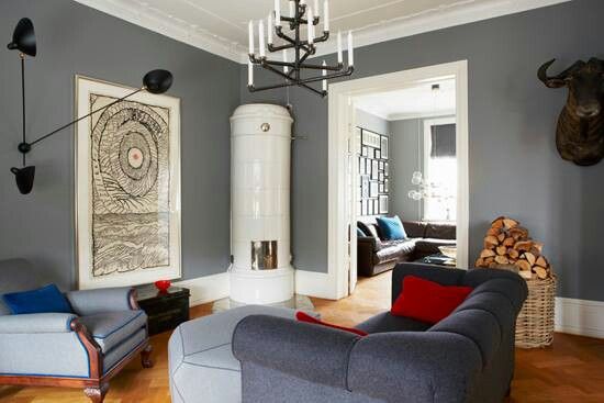
FB MOLES BREATH

Pavilion has a warm undertone.  Looks great with white trim.
FB PAVILION
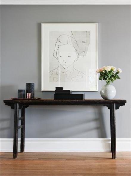

FB PAVILION

FB PAVILION GRAY

FB MANOR HOUSE GRAY

FB MANOR HOUSE GRAY

FB PLUMMET

FB PLUMMET

FB PURBECK STONE

FB PURBECK STONE

 You can see how the colors varies from photo to photo - the reason is that light affects paint color - and I'm quite sure that Irish light is going to be different than California light... so please try a few samples first.  I hope you find a color here that will work for your kitchen!


6/4/15

GRAY RULES

If you love gray, you are not alone.

Our love affair with gray started quietly,
but quickly became the popular choice for neutral wall color.
It is loved by homeowners and designers alike.

I find it hard to name a color that doesn't look good with gray
and all but a few colors have a gray version.
The sheer multitude of grays is both a blessing and a curse.

The undertones that make gray more than just a color of concrete,
also make finding the perfect hue difficult.

But there are rules to making your gray experience successful...

1.
DON'T LET IT GET TOO CHILLY....

There are warm grays and then there are grays that have a definite chill factor.
Grays with beige, brown and some purple undertones are warm grays.  
Most plain grays, silver grays and grays with a blue or green undertone will feel cool.
I'm not saying to avoid them, just be wise.

If you choose a cool gray, balance it with some warmth.

If you choose cooler gray tones for your walls, remember to add some warmth.

Warm toned woods, floors, rugs, even the matchstick blinds in this photo
take the chill off this room.

2
ADD LOTS OF WHITE

White freshens gray and keeps it from feeling heavy
or depressing...
Fresh white trim, woodwork,fabrics, curtains, etc...
They just look amazing together...


 3.
 UPDATE YOUR METALS
 Something magical happens when you add warm metals to a cool color...


Silver or stainless is the usual choice when people think of gray.


It's true - it looks nice!

but warming up your metals creates a little magic..

and as gold and brass are back...
give them a try...


 More rules later.....  bye for now


QUESTION FROM A READER;


I have a very open floor plan with 2 story ceilings...I love the gray colors.  Looking for a warm neutral that will flow through living room, kitchen, and up,the stairway...I like,blues...been looking at BM ash wood...will,this work, or do,I,need a color a little deeper because of,the high ceilings...thanks so much.

Regards,
Sandra white | Hloo@aol.com

Hi Sandra,

'Blue' and 'warm neutral' are polar opposites.  Blue tones are cool.  So when you say you want a warm neutral I'm assuming you are thinking something that will go with blues because you will be using blue as the accent.  


In that case, Ashwood is perfect.  
ASHWOOD Benjamin Moore


I would also try Grant Beige that is a little deeper in color and see which one you like the best in the vaulted ceiling area. 

GRANT BEIGE Benjamin Moore

They are safe bets, since I don't know which hue of the blue you like.  Good luck!

5/28/15

SMALL WORLD - DIY TERRARIUMS

BIG IMPACT...

I have lately been exploring the world of the terrarium - 
It would be the perfect thing to put near my kitchen window.
They bring nature and the garden right to your face - and they are beautiful!

First I wanted to know if I could keep them alive...
I'm the Great Houseplant Killer in my family...
Don't leave one in my care.  
Ever.

Refinery 29
They do seem easy to care for, requiring only sporadic, minimal water 
as they create their own little microclimate in their container
and the glass (especially if it has a lid) creates a greenhouse effect.

Pinterest
They need bright indirect light, but not direct sunlight as that, combined with the glass container, 
would fry them quickly.
Flickr
My kitchen window looks out onto a covered patio - no direct sun - the perfect spot.
Instructables
I have plenty of glass containers to try, but not all have lids, 

and a lid seems to allow more control of the terrarium environment.
weegreenspot
If the glass fogs up a little and there is too much moisture - 
Flickr
removing the lid for a minute or two can correct it.  

Centro Garden
Put it back on when the fog is gone and it prevents further evaporation 
making it possible to go for long periods without adding moisture.


Then I saw these solutions for containers without lids...
Flickr
Glass orb... great idea!
Zest it Up
wooden disk with a knob -
problem solved!

Better Homes and Gardens
Here's a link from Better Homes and Gardens on how to make them 
and a tutorial from Martha Stewart...if you'd like to join me in this experiment. 

For more beautiful inspiration, here's a link to my Pinterest board Terrariums and Topiaries.

If you have tried these small world gardens with success, I would love to hear about it!


QUESTION FROM A READER

Hi there,
I have oak kitchen cabinets in a kitchen/ dining room in one.  The dining room table and hutch are oak as well.  I need a suggestion for a paint colour to bring out the set.  The oak isn't really light, yet not too dark.  I have lots of light coming in from dining area.  Can you suggest a colour for the walls and drapery?  It is painted a sage green and I would like to make a change.  The trim is white and I want to leave the trim the same  ( counter top has different brown in it)  I look forward to hearing from you

Regards,
Carol | 

Hi Carol,

To bring out a warm color - go the polar opposite.  Try a cool gray toned color.  For example, the opposite on the color wheel to red, is green.  The opposite of orange, is blue.  The opposite of yellow, is purple.  Red, orange and yellow are warm colors, and their opposites, or the colors that bring out their best, are cool colors (green, blue and purple).  You have lived with green for a while and want a change, so I would try a gray with a blue or purple undertone to bring out the warm tones of your wood.  


You can go gray and try these with a blue or purple undertone.

BM Abalone (Purple)

BM Pebble Beach (Blue)

BM Rockport Gray (smidge of Purple)

BM Eternity (Blue)
BM Sandlot Gray (Purple)
BM Wet Concrete (Purple)

Or you can go color and try these with a gray undertone.


BM Pleasant Valley

BM Slate Blue


BM Mauve Desert


BM Victorian Mauve

GOOD LUCK!


WHAT DID YOU MISS?

link within

Related Posts Plugin for WordPress, Blogger...