IT'S OFFICIALLY TIME TO DECK THE HALLS...
So, naturally, I had to check out the holiday decor to find a little inspiration for this holiday season
 |
| Rogers Gardens, Corona Del Mar, CA |
Ah, so gorgeous ...
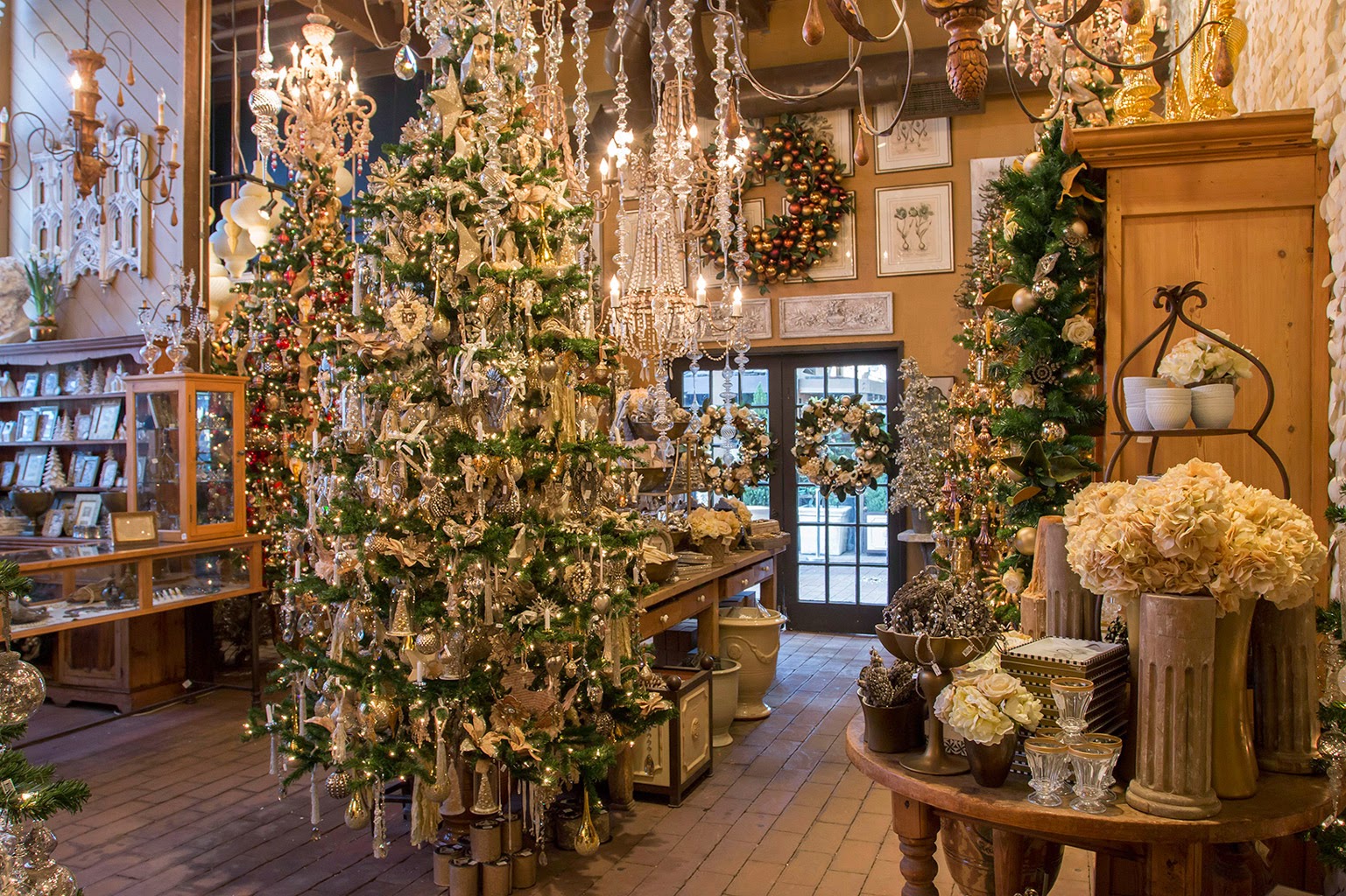
literally took me 20 mins to get past this FIRST tree

so much to see here -

this tree had burlap, paper, tassels, rhinestones, glitter and lots of silver and gold -
it was my favorite

Inspiration from TPT Home (Tai Pan Trading)
This tree is from TPT Home. I did get some inspiration here -


red and green just never gets old...

This next tree had so many good ideas and unique color choices

apple green, burlap, silver, white and gold
I liked how the ribbon was applied..

and I loved the ribbon combinations


plenty of picks added, including frosty magnolia branches,
pinecones and antlers...

rustic elegance


Meanwhile, back at Rogers Gardens...

a woodland tree

I'm a sucker for mushrooms and toadstools...


and pinecones and owls...


Their assortment of wreaths is always beautiful...


and wonderful fresh flower planters

and I've managed to finally move past the first tree...

to this silver and glass tree - also full of gorgeous ornaments
and on to an all white tree

with a paper cut star topper

and exquisite lace snowflake ornaments


Here's a unique wreath with
wooden spools wrapped in velvet ribbon

loved these star lanterns...

All glass and crystal tree....looking icy!

Things warmed up in the rear of the shop...
candy and the color red took over this tree

with large candy filled apothecary jars tucked into the branches


Gingerbread cottages - made from things other than gingerbread


past the gingerbread and on to the Santa tree...

using santas showcased in white lanterns
a clever idea, but maybe just a little large on the lanterns?


I loved this sunburst mirror

and even more with the combination of the mirror and the wreath

and I really liked these message wreaths

but the price tag of $200+ kept them here and not on my door...
This little glittered number did come home with me...

One of my favorite looks for Christmas - red and white cyclamen
our mild winters in California are to be thanked!

Outside fountains bubbled and toy trains chugged

in the 80 degree weather...

Poinsettias waiting to go home for the holidays...


Shinoda is a trade only shop... but they always do elaborate displays.
Shinoda Design center had some good ideas

loved the frosted ferns..


and the snow crusted poinsettias


Rustic and Woodsy is big...
Plaid is back this Christmas...

but the real reason I go to Shinoda is the ribbon...

Here's what I chose for one of my clients' decor this year...
found the gray and white flocked woodland ribbon and this pewter and silver
and combined it with the burlap for some warmth...

and then found this pewter and silver banded ribbon

thought they looked pretty delicious together...
can't wait to decorate!
Happy Holiday Decorating!
Hope you found some inspiration here...

****************************************************************
QUESTIONS FROM READERS:
Claudine,
Came across your blog and was so impressed with your wealth of knowledge on colors... I am and have been stuck on colors! Finally after deciding on color to paint walls (BM--Shale)... I am now having to rethink sofa color (wanted stone color but not sure color will work...big mistake if I have made in wrong color and it wouldn't work with now painted wall color)

as well as now pickled white wash maple cabinets don't match!


Please see picture. My floors are stained concrete -- color is special made color (cross between mahogany and cherry) please I desperately need your help!
 |
| Benjamin Moore SHALE |
There is nothing wrong with your color choice, as you can see by these very similar photos...


If you deepen your wall color, you will have something more like this...


Adding more contrast in the form of accessories can help bring in more contrast to the living room area.


Good Luck!


.jpg)


.jpg)


