1/24/13

UNDERSTANDING UNDERTONES

WHAT COLOR IS THAT... REALLY...?
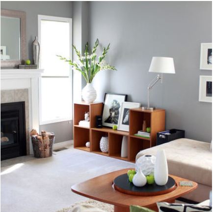
Welcome to the world of gray.
And I do mean world.
For it seems there are endless grays
and gray no longer means the color of cement

12/20/12

CHOOSING PAINT COLOR FOR A BEACH HOUSE

ABOUT THE BEACH LOOK

A beach house needs to be comfortable and easy care, impervious to sand and salt water, with soft and calm colors.  The view outside needs to take precedence over the view inside. That means distressed wood, stone, weathered paint finishes, easy care slipcovers, painted fresh white woodwork, and the muted colors of sand, sea, driftwood, sea glass, and shells.  Toss in the cry of gulls, sound of surf and ocean breeze and a porch or patio to take it all in - and you have HEAVEN.

10/4/12

IN PURSUIT OF BEIGE


AVOIDING THE 'FLESHY' LOOK
Atmosphere ID
We've all experienced it.  That shade of beige we are sure is perfect for the house.  Bring the paint swatch home - or in some cases, slap it on the wall - and suddenly it's not beige at all.  It's some odd
shade of pinky, orangey - yes 'fleshy' color that is COMPLETELY wrong.

9/27/12

THE TROUBLE WITH PAINT COLORS....


THE ART OF CHOOSING COLOR
Southern Chateau

Today, I'm addressing a challenge a lot of us have. 
Whether we are using a fabric swatch, a photograph, or standing in front of hundreds of little colored squares
there is one thing we all face when decorating, or redecorating our homes.... 
TROUBLE PICKING PAINT

9/26/12

DRIFTWOOD


GRAY AND BEIGE ARE FRIENDS
Skagway, Alaska
Driftwood store front
I took this photo while cruising the beautiful waters of Alaska.  I could blog on and on about the colors of the water, the mountains, the glaciers, the sky....and I probably will, one day.  Alaska - incredible scenery and fun little towns like Ketchikan and Skagway, where I couldn't resist this little building completely covered in lovely, soft gray driftwood.... charming, isn't it?

WHAT DID YOU MISS?

link within

Related Posts Plugin for WordPress, Blogger...