1/31/20

WHAT I'VE BEEN DOING...WHAT HAVE YOU BEEN DOING?

I started to recap all the events of last year and it was TMI, even for me - who lived it...
You would have given up reading after the first couple of events because I had massive amounts of pictures.
I have a hard time talking without pictures - I'm a very visual person.  Plus, they say a picture is worth 1,000 words, so then I don't have to say as much.

After looking at that ridiculously long post I decided to break it up.  Because I like the pictures.  And I like not having to say as much.

So, here's a little bit of what I've been up to lately.  I hope you enjoy the pictures.  And way less words.


2019 was a busy year.
It started out normal...or as normal as can be expected for a slightly weird person...
(and then someone shook the crazy tree and crazy rained down on us for the next several months...)

My son went to Patagonia on a wedding photo shoot and sent us back some amazing photographs..


Penguin Island


His talent takes my breath away.  
And Patagonia is GORGEOUS   
(You can follow him on Instagram at Jamezillasaurus or check out his website here.)

Our friends introduced us to a great burger restaurant - Hopdoddy Burger Bar.
The truffle french fries...oh, my...
A big thumbs up.
The Hubs with friends

And about this time I grabbed some clever friends and decided to further complicate my life by offering classes in my home to friends, clients, their friends, etc., so...
We decided to call it 'Making HOME'.

Relying heavily on my clever friends,  we organized a few MakingHOME classes before the crazies hit...


Valentines...
With a demonstration of a romantic dinner for two of Salmon cooked in parchment...
see recipes here


Spring...
We taught how to make your own mayonnaise, dressings, and individual layer cakes...
see recipes here
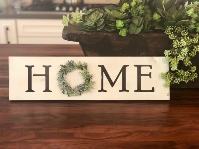
and made this fun sign...
Easter...


Garden Class 
at Betty's amazing garden
adding more photos here because how can I not ?
her yard is amazing


(see recipes, etc. from classes at MakingHOME )


Stay tuned for more....

7/10/19

TIDYING UP

I've been bitten by the tidying bug.  I can't believe I've already watched the whole first season of Marie Kondo's Tidying Up.  I was watching while cleaning the kitchen the other day, and my tea towel drawer is now meticulously organized... I was even able to engage The Hubs in a couple of episodes and he is game to try it out.

So here's what I love about her method...  She doesn't tell you to get rid of stuff.  I have stuff.  I have business stuff, and sentimental stuff, and home decor stuff, and family stuff and some of my mother's stuff and some of The Hubs mother's stuff - stuff I inherited, stuff I feel guilty tossing, stuff I need, stuff I might need someday, paper stuff, holiday stuff, fabric stuff, design stuff, client stuff, photo stuff, garden stuff, craft stuff.....

I have stuff.

She simply asks that what you keep "Sparks Joy".

Not guilt.

Joy.

I can do that.

The Hubs can do that.

"Marie Kondo’s lessons show that in focusing on what does not make you happy, you’re only inviting unhappiness into your life. If you look around your home and dwell on those items you can’t stand, you’re just generating more negativity.  Pick up an item, touch it and ask yourself if it “sparks joy” in your life. If not, set it aside.  KonMari states that you must touch every single item before you get rid of it. There’s no need to bring any “rational thinking” into the mix at this stage. You need to feel the item. Use your emotions and feelings to make a determination as to whether or not you’re going to keep something."

You are supposed to start with your clothing, but I was in the middle of folding tea towels as I watched... so...in my tea towel drawer, I put the ones that I wanted to keep.  They matched my kitchen, they were unstained, fresh and clean.  I folded them the Konmari way.  The drawer is a sight to behold.  It sparks joy.

Kondo has come up with what she believes the ideal order to tidy up.  Instead of room by room, she asks you to tidy by category:  Clothes; Books; Papers; Miscellany; Sentimental.   I would need to add creative to that, since its big enough to have its own category at my house.
She also thanks the things she discards for their place or service in her life.
She talks to the house. (to suss out its spirit -)
She shows respect.
She sparks joy.

She's adorable.

I'm ready to attack my house - are you?

7/3/19

EASY WAYS TO ADD COLOR TO YOUR NEUTRAL DECOR


Both The Hubs and I love a certain old pottery called 'flow blue'.  It was originally a mistake, back in the day when it was made.  The blue dye 'flowed' where it shouldn't when the plates, bowls, platters, pitchers and other tableware were fired/glazed.  The British manufacturers deemed it inferior and sent it to the colonies - but instead of garnering criticism, it became very popular... instead of a 'mistake' it was thereafter done on purpose as the demand for it grew.  I loved the deep blues of this antique dinnerware long before I learned the story - but the story served to make me love it even more.  

I also root for the underdog...


I have a good bit of this in my house, and so I add pops of color to my otherwise neutral decor by displaying the platters and plates and pitchers here and there.

Ceramics, pottery, and other like accessories can add pops of color in a small way, or you can opt for a more direct pop with paint.

While a whole room of deep blue might be a little heavy, anchoring a focal wall with color can bring some personality to a neutral room.  I love how in this neutral room, the blue wall adds a focal point and anchors the family photos - all black and white and framed the same size and the same way for uniformity. 

Fabric is a more permanent way to add color - in the ottoman above and the sofas below - 
definite color is added with furniture.  


When adding color, you can also think past walls and fabric to woodwork.
Think of the mantle or bookcases

or your kitchen cabinetry


A fresh coat of paint often updates tired pieces of furniture


Rugs can add color nearly anywhere

In this room, turquoise is repeated in fabrics, accessories and artwork to wake up a neutral room

Nothing wakes up a room quite like nature.  Fresh flowers, plants, botanicals... they add life.


I love to be surprised by color in an unexpected place.

If you want to color to your home, but are a little unsure how to achieve it...

  START SMALL 
 with an accent or two...

 BRING TOUCHES IN 
WITH  FABRICS
OR A RUG

OR A COLORFUL ACCENT PIECE

ADD A FEW ACCESSORIES...

JUST  REMEMBER TO KEEP THE COLOR CONSISTENT THROUGHOUT ANY OF THE ROOMS THAT ARE OPEN TO EACH OTHER.


 Good luck!

*******************************************************

 QUESTION FROM A READER:

Claudine,

I have just discovered your blog and I have spent the last few weekends going through your previous posts..love it!!  I need your help with selecting a paint color for my living room and dining room which are open to each other. Both are fairly open to the kitchen (can see both from kitchen with double width entries to both). With the help of another color consultant several years ago I selected BM mellowed Ivory for the kitchen walls, BM River Gorge Gray for my cabinets and BM timid white trim. 
Benjamin Moore - MELLOWED IVORY

Benjamin Moore - RIVER GORGE GRAY

She had advised that I paint the dining room area (3 walls) BM Timothy Straw and the Living Room Mellowed Ivory as well. 
Benjamin Moore TIMOTHY STRAW
The color were based upon the upholstery fabric in the living room. 


I like the cabinet color and pleased with the mellowed ivory for the most part (certain light it can be bit much) but I don't think I would care for it in the living room. I will probably purchase new furniture within the next few years so don't want to base my selection on the furniture (images attached ) but don't want it to look off either. Current floors will be replaced - will probably go with a walnut stain wood. Is there a neutral in the gray tones that would work? If not, open to any other suggestions. Note that we get quite a bit of morning/afternoon light. I appreciate any advise you can provide. Thanks, Cindy

Hi Cindy,
I think a nice neutral gray is exactly right for your color scheme.  Try a few of these colors out in your home and see what looks best.  I think you will really like the cooler tones with the upholstery you currently have.  And they are neutral - so will probably look as nice with furniture of the future as with the furniture you currently have.


Northern Cliffs (Benjamin Moore)


Seattle Mist (Benjamin Moore)
Silver Mist BM


BM Beach Glass


BM Smoke


Good Luck!

WHAT DID YOU MISS?

link within

Related Posts Plugin for WordPress, Blogger...