4/20/15

FIND YOUR PERSONAL STYLE


There are certain images that stay with you.
Pages you tear from a home decorating magazine or
images on Pinterest,
You keep coming back to them because
something about them attracts.

Studying those photos can help you discover your own personal style...

the colors 
so soft
the opposites (the formal, antique settee - with the fun contemporary pillows.
the pillows make me smile.


a little calm oasis for the eye
the odd color combination - olive and blue/green (gorgeous)
the botanicals!

high contrasts...
matte gray background
white painted built-ins
more than just books in the bookshelves...


rustic wood with shiny mercury glass
colors - tan and gray together
the contrast of the milky white against the cool gray


When you are drawn to a picture of a room, take a minute to find what you find appealing in that photo.  
You might discover what you don't like, too.
And that is nearly as important.

Do it for several photos and you may see a pattern emerge...
It may be just that easy to determine your personal style.

chunky legs on the island
the warm dark wood floors
white cabinets
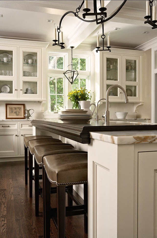

details - ceiling, windows
leather counter stools with nail heads
warm woods with cool white
simple lines
non-fussy


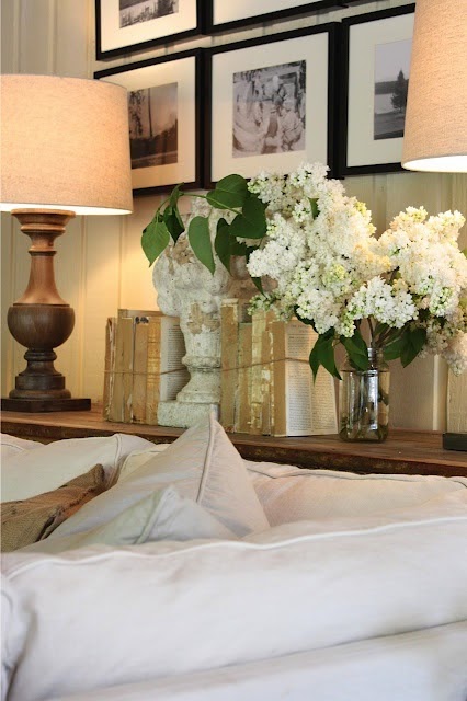
A cozy nook with books...
linen upholstery
fur throw
blue and white - always a favorite


****************************************
QUESTIONS FROM A READER

Hi!  We just had our kitchen hallway and living room painted professionally.  I chose two Benjamin Moore colors after sampling 12 colors on the walls and finally settled on Dry Sage for the kitchen and hallway and then Greenbrier Beige in the living room.  The walls are adjacent  The painters did a beautiful job but I am in an utter panic now that it is fully painted  that the Greenbrier Beige is picking up the green from the dry sage and as a result has everything looking muttled.  I find that my eyes keep playing tricks on me and the greenbrier beige looks green vice a versa and then it all ends up looking one color or muddy and I am so worried I made a mistake. 

I'm not sure what I should do - my husband does not want to repaint but I am open to it if I was confident that the next color would be the right one.  I like both the dry sage and greenbrier beige separately but I just don't think I like them together.  I would prefer to keep the dry sage over the greenbrier beige.  We have oak cabinets in the kitchen and an oak colored laminate floor throughout and the dry sage looks great in my kitchen.  I wanted a color to compliment the dry sage - a neutral that had some warmth and personality to it and that would showcase our fireplace and white trim.  I can send pictures of the rooms if needed.  Any advice would be sincerely appreciated.  Thank you!!
Regards,
Catie 


Hi Catie,
As you can see in the pictures below, the colors you chose are very similar in value, with Dry Sage being a more dominant color than the Greenbrier Beige.  It has more warmth, and so comes toward you more, while the beige is more subdued.  


Wall color is always affected by the adjacent colors, woods, ceiling height, room size and light.  Your Greenbrier walls are being strong armed by the Dry Sage.  If the beige was a little lighter and not so close in value, they wouldn't be fighting so much.  Because they are very similar in value (strength) - your eye sees them as the same and sometimes they blend together a little.  I think this is as simple as creating more of a contrast from room to room.
You can try Manchester Tan (BM) in the beige tones


Grey Mirage (BM) in the gray hues

or go to a completely different and cooler tone with a blue
Try Quiet Moments or Sea Haze

When you do put a sample on the wall - make sure you paint it (two coats) on a poster board
with a good 2-3" margin around the edge so you can lessen the effect of the existing wall color on the new.
Pin it to the wall and observe it throughout the day in all the types of light your room experiences.
If you like it - buy it and put it on the wall!
Good Luck!




4/9/15

THE BENEFITS OF A SOFA TABLE

If you feel like your walls are crowding you a little,
try some of these tricks to expand your rooms.

1.  Cool down your walls - warm toned colors seem to move toward you
while cool toned colors recede.  Something as simple as going from gold to gray can change your life!

2.  Declutter.   Too many accessories, too many things on the walls, too many pillows, colors or patterns...
all stop your eye on the way across the room and can make things feel visually crowded...

3.  Add a sofa table...
Sofa tables have long been used to punctuate the back of a sofa in an open floor plan.
They are good little indicators of the stop and start of a defined area...
as if to say - 'there! that's the end of the living room and beyond this is the dining room...'
They provide a place for needed lighting, 
and accessorizing... but my favorite use for them

is to expand a living space...
Its a long known trick in decorating that pulling the furniture away from the walls a little
actually makes the room feel larger.
That bit of dead air space beyond the sofa fools the eye into believing
the room is larger...
"Look!  We have all this room behind the sofa!  What a large room!
When there are things in that space...
like lamps and accessories..
it further enhances the feeling that there is space beyond the sofas.
Sofa tables (or console tables) are great opportunities 
to display some of your larger accessories
(don't let it get too cluttered with the smalls)
(Pottery Barn has been doing this successfully for years....)
So, if your room feels a little tight
here's another little trick for you to make it FEEL larger...


************************************************************

Letter from a Reader:


Hi Claudine, I enjoy reading your blog so much and want to thank you for educating the world about undertones and the magic that paint can do in a room!  

I'd like to ask for your recommendation on my bathroom paint. Currently it is beige with heavy green undertone, but I'd like a lighter and cleaner look. The room doesn't get too much of sunlight. It has granite countertops in the color shown in the pictures (yellow with reddish speckles), and the tiles in the shower and floor is true gray like in the picture. 


The sinks are located separately in each side of the bathroom, so the dominant feature is the gray tile. What would you suggest a good paint that will complement the gray tiles and quiet down the countertop? The crownmolding is true white. 

Also, do you suggest the ceiling (10") is painted the same color as the wall or kept white? 
Thank you so much in advance! 


Your granite and tile have grays and a soothing gray or greige (gray/beige) in a lighter tone would compliment both.  Look at Edgecomb Gray (BM) or Amazing Gray (SW) which have a good beige undertone and should keep things calm - even the granite.
BM Edgecomb Gray

SW Amazing Gray
Good luck!


4/1/15

WHAT COLOR SHOULD YOU PAINT YOUR HOUSE?


That's a loaded question...
via
and with all the paint color possibilities out there
[thousands]
you are not going to want to hear my answer...
via
I. DON'T. KNOW.


Selecting a color you want to live with day in and day out
is a very personal choice
via
and I don't know you
yet.

BUT I CAN HELP YOU DISCOVER THOSE COLORS
if you give me some good information,
some photos of your space
and possibly some photos of the rooms you love.
via

DON'T WORRY ABOUT A COLOR FOR EVERY ROOM,
your home will do just fine with just 3-4 colors
[more or less depending on size].
via
BM Pleasant Valley Blue

Too many color changes can make your eye stop and start
which makes your home feel smaller
because you are seeing individual spaces instead of an overall flow  -
especially if you have a more open floor plan.
via
Don't be hesitant to reuse colors throughout your home,
it creates a color and design flow that is good to have

USE SOFT NEUTRAL TONES
Why neutrals?
Because they last.
Because they are a good background.
Because they STAY in the background.
Because they go with so many many other colors.
Because they don't take over the room.
Because your furniture and art look awesome with them.
Because they are more livable.
via

WHAT IS A NEUTRAL?
Nearly every color can be a neutral.
I call it 'graying it down'.
Basically, its the muddied or gray version of that color.
A softer, more soothing version.
For blue, its a gray blue version of every hue.
Some are gray with a blue undertone.
For green, a grayed green.
via
Browns and beiges go softer into gray beige and taupes.
Purple gets muddied and softer.
Some colors are already neutral - of course
but it doesn't have to be limited to beige, tan and gray.

TRY BEFORE YOU BUY
You simply MUST try the samples in the actual rooms
Why, you say?
via Pinterest
Your home's light,
its ceiling height,
its room size,
the flooring,
the number of windows,
the direction the room faces,
the current color on the walls..
all will affect paint color.
via
What looks perfectly lovely in a photo of someone else's home,
or on the paint swatch at the paint store,
can look completely different in your space.

So, buy a sample of the paint,
and some poster board,
paint one coat and let it dry,
(leaving a good margin of white around the edges)
then paint another coat - just like you would on your walls.
via
When it is dry, thumbtack it to your wall
and observe the color throughout the day.
Move it around,
see how it changes, and how it looks in natural and manufactured light.

If you love it
BUY IT!
AND PUT IT ON YOUR WALLS!
via

HERE ARE SOME BEAUTIFUL, LIVABLE, LOVELY
NEUTRAL COLORS TO CONSIDER

AGANTHUS GREEN Benjamin Moore

BRANDON BEIGE Benjamin Moore

GRAY WISP Benjamin Moore

GRANITE GRAY Glidden Paints

MAGNETIC GRAY Sherwin Williams
MUSHROOM Sherwin Williams
via

SEA SALT Sherwin Williams
via

SVELTE SAGE Sherwin Williams
via
MOONSHINE Benjamin Moore
via
THUNDER Benjamin Moore
via
BOOTHBAY GRAY Benjamin Moore
CAMOUFLAGE Benjamin Moore
via
CAROLINA GULL Benjamin Moore
DRY SAGE Benjamin Moore
GRASSLAND Sherwin Williams
GRAY CASHMERE Benjamin Moore
GRAY HORSE Benjamin Moore
via
NORTHERN CLIFFS Benjamin Moore

PALE SMOKE Benjamin Moore
via

PASHMINA Benjamin Moore
SEAFOAM STORM Valspar
via
SEATTLE MIST Benjamin Moore
 *********************************************************************************

QUESTION FROM A READER:

Hi There,

We are looking at updating our home using the gray palette. I want to use grays that have green or brown undertones and I really do not want the blue; however, if I have to have an undertone I would go with the blue.  I have read you recommended to use three colors throughout the home.  How exactly do I go about doing that?

Our master bedroom is rather large.  I would like to accent the wall that the bed is on with a dark color like graphite and graphite may be too dark.  I would appreciate color ideas on guest bedrooms, dining room, living area, entry, daughter's bedroom and hallway. I want to create a modern looking home.  I would greatly appreciate any advice you can give to me.

Thanks so much!
Charlotte

Dear Charlotte,
Choosing a color palette for your home requires a little homework.  For example, what are the permanent surfaces like - tile?  wood?  carpet?...  The colors on your permanent surfaces will help determine what colors to use because they will have to coordinate with those surfaces.  Do you have existing furniture you need to consider?  Once you have that squared away, go to your neutrals in the paint colors swatches and pull out a few that appeal to you.  Hold them next to the permanent surfaces to see if they blend well. Do the same with the furnishings that will remain in the room.  Choose 3-4 that look good together and that look good with your permanent surfaces and furniture, and you will be well on your way.  Neutrals are easier because they go with nearly everything.

I can suggest a color for your bedroom, but if you want help with the other rooms in your home, you can email me privately for a quote on a color consultation.  Unfortunately, I am only able to answer one question in this format.  I'm including a photograph of a room where I did a graphite accent wall and I think it turned out rather beautifully.  The color I used is Dunn Edwards/California Paints LEGENDARY GRAY.  
www.yournestdesign.blogspot.com
Good Luck

WHAT DID YOU MISS?

link within

Related Posts Plugin for WordPress, Blogger...