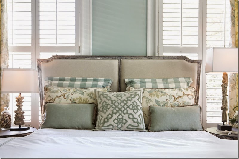
Bathrooms are hard places to design..

and by hard, I mean lots of hard surfaces
tile
stone
glass
porcelain
porcelain
wood
mirrors....
not a lot of softness in a bathroom
which is why a lot of thought should go into one
for although bathrooms are mainly utilitarian
and surfaces need to be cleanable and practical
they can also be very, very beautiful...

who says the shower needs to go in a corner? Love this example from Metropolitan Home
of this wide open bath where nothing is ordinary
including the clam shell that hides the drain...
framing out a basin and mirror with a wall of stone or tile
makes washing your face a thing of beauty

mixing elements keeps things interesting...
like the marble and chrome vanity with exposed plumbing and the gilded candlestick lamp

unexpected..
backsplash doesn't mean 6 inches above the vanity in this beautiful bathroom
it encompasses the entire wall

and while you are contemplating faucets -
they don't all have to sit on the vanity...
I keep thinking how much easier to clean these wall faucets would be...
Brooke Gianetti and her husband create beautiful homes...
and I particularly like their creative ideas with bathrooms

so clever to create a pony wall that is the perfect spot for a bench
and the opportunity to add a little softness and a little color...
When in doubt, trim it out....
The paneled walls, cabinet, paneled tub, subtly veined marble
deep crown molding and soft creamy color

all combine to create this inviting space
whenever possible - add fabric

fabric does wonders to soften hard surfaces, draw the eye, add texture and color
and if you are a 'soak in the tub' sort of person - make a statement
Sometimes the logical place for a shower is the corner...
but trimming it out with panels and molding will make it more of a statement

I love the simple floor design - completely elegant

I like all the elements in this bathroom...
visible towel storage creates some of that softness we are looking for...


Try sconces, instead of vanity lights
to put the light right on your face where it belongs

the wall color makes this room
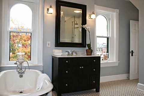
the soft gray blue complements the wood tones...

but the real beauty of a bathroom are the materials we use

the woods

the tile or stone

the details...

Hello,

Stumbled across your blog today, absolutely right time, right topic and so much information. Actually, I think it was providential that I saw it.

My husband and I are near the conclusion of a kitchen redo. We changed a
few things but basically used the cabinet structure of our old cabinets
and changed the doors and painted them. They were the old ugly orangey oak cabinets of yesteryear, my apologies to anyone still in love with them.
Anyway, down to business. I have always been an individual drawn to deep
tones and colors. Any actual color that I gravitated to whether a green,
always Emerald, blue, Sapphire, red, ruby...you get the idea. So I decided that I would change it up a bit with this kitchen/family room adjoined space. Our appliances are all white, which I actually like and they are recent purchases so I wasn't going to change that. The cabinets have been transformed with these two colors SW 7668 March Wind and SW 7669 Summit Gray.

 |
| SW Summit Gray |
All my wood trim in the house is white. I chose the color SW Rain for the walls. When I got home yesterday, I wanted to cry because my cabinets are reading blue.
 |
| SW Rain |
Please help me because I cannot have the cabinets taken out and repainted again. I know that I am going to have to change the wall and ceiling color.
Oh, the other finishes in the kitchen will be Cambria quartz counters -- new Rococo, resembles Carrera marble with classic white subway tiles for the backsplash as well as up to the ceiling.
I chose an antiqued bronze hardware from rejuvenation for the pulls and knobs. Also I have two school house pendants over the island that are also antiqued bronze. Also, my floors throughout the entire downstairs is 3/4 inch hardwood oak stained really dark.
I want to really love the space but this is really throwing me for a loop.
Please help.
Grateful,
Jorja Price
Jorja,
One of the things that will affect wall color (or cabinet color) is reflected color from walls, etc. SW Rain is not a shrinking violet color - it has strength and a lot of pigment. It has at least the same amount of strength as the grays you painted your cabinets - and so they will definitely influence one another.
If you look at kitchens with medium to dark gray cabinets, you will find the walls in those kitchens are generally very light in color, a light taupe or beige or simply white. Color - especially the bright hues and jewel tones you so enjoy - can be brought in with accents and accessories. They will be the pops of color that bring interest to the room, but not the wall color.
So my recommendation is to go with a nice creamy white, a gray beige or light taupe for walls and ceiling, or a color that is nearly a white.
That may seem a little neutral to you, but your cabinets will read the grays you intended. Here are a few examples of what I am suggesting...
 |
 |
| Ashwood BM |


 |
| Manchester Tan BM |