10/18/14

THE COLOR YOU CRAVE: BLUE

When I look in my closet the color I see repeated most often is
Blue
It is repeated in my jewelry box - in the shade of  turquoise - 
a stone of which I can't seem to get enough.

Blue has always been a favorite. 
 It is ocean and sky. 
It is calm and peaceful.

It is light as air, as dark as midnight
It is indigo and icebergs


and baby boys
and robin eggs

 and hydrangeas and cornflowers

It is royal.

For those of us who crave the color blue - it calls to us in many shades.
and it is particularly lovely in our homes...
I never use a full strength color on my walls
I always choose a grayed down version
it is more liveable
more long lasting
more neutral
like the grayed down blue/with a touch of green color above

while this color is more of a gray with a blue undertone
that still reads blue
but is neutral and easy to decorate around

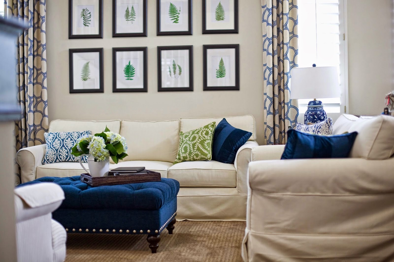
blue and white is a fresh, clean and classic combination


navy is dramatic, lovely and dark

and perfection in this grayed down version
fabulous in a kitchen
sometimes only a spatter of blue is enough

but complete immersion is equally acceptable

blue loves white, or black
silver or gold


formal or casual


 but lets face it - there is no shade of blue
 that isn't beautiful
 or fresh
 or soothing
or tranquil
but it can also be vibrant
classic
muted
 dramatic
soft
or cozy

Is blue a part of your life?

a small part?

 or a wrap me up in it big part? 
 Easy going blue goes with any style of design
and any wood tone you can imagine
is there a blue in your future?

**************************************************


Dear Claudine,

Love your blog! I’ve gotten lots of inspiration from your design ideas. I have a question for you about my out-of-date 80’s home that I’m hoping you have time to answer. I’d love to update my 80’s oak cabinets and was thinking of painting them white. Same with the fireplace mantel in the adjoining family room. 


But I like having stained wood trim in these rooms! I have a window and door very close to the fireplace. In the kitchen there is a large bay window right next to the cabinets and a smaller window between cabinets over the kitchen sink. Would it look ok to have stained trim with white kitchen cabinets / fireplace? Or do I need to find another solution to update my kitchen?

Thanks for any advice you have!

Rachel Devine


Hi Rachel,
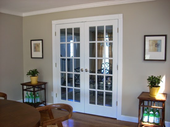
I have seen windows trimmed in wood that work - especially if they also have an additional white painted molding as well - as in this photo.


and in this one

In your kitchen if your cabinets are white and the trim is wood toned, the window will be the thing that draws the eye.  It will stand out like a sore thumb.  However, if you add white molding around it, you can enjoy the warm wood and still tie it in with the mantle and the rest of the home and make it stand out less against the kitchen cabinets.

Good luck!
Claudine


10/7/14

SMALL CHANGES, BIG IMPACT


UPDATING YOUR HOME CAN BE AS SIMPLE AS CHANGING OUT A LAMP.. OR TWO
(just a little at a time)

CBID Design
CBID Design
Or the cushions on a sofa...
 

CBID Design

A change of artwork...
CBID Design

CBID Design


Or some paint...
CBID Design

CBID Design
 and a little window dressing...
CBID Design

CBID Design

 small changes....
HUGE impact...


*****************************************************************8

Hi Claudine,
I love your style and need your advice. I'm in the midst of remodeling my kitchen to white cabinets, Calcutta marble counters and gray wood floors. 

I've knocked down a wall from kitchen to open into the dining room. 


My question is what paint color to use that will pair well from kitchen, dining rm to living rm. 

I'm keeping the red sofa and want a different look from the country French that isn't austere, but clean and casually refined. Replacing old table with a round one from Restoration Hardware. Your thoughts are greatly appreciated!
Sincerely,

Diane

Hi Diane,
Your kitchen sounds yummy.  I have a friend who recently did her kitchen in the same tones - 
 Looks great, doesn't it?  I helped her repaint the yellow pine cabinets to this - finished with a hand buffed antiquing wax (Brie Wax).  

The palette you have chosen is very soothing.  You should keep it that way throughout these rooms that flow together.

For the Kitchen/Dining Room area, I would use a greige or medium gray toned paint....
Find one that looks great in your kitchen and that will flow into your dining room and be elegant there as well.  

Grant Beige, Benjamin Moore

Agreeable Gray, Sherwin Williams


In the living room, your sofa is going to dictate the look.  If you can replace the toile pillows with another plain fabric pillow, it will take away a lot of the country french look. 
As for wall color, a light gray works...

as does white...
but I'm thinking a white with a touch of color, or a near white
would be more calming and contemporary

I love Crisp Muslin by Dunn Edwards/California Paints

and Whisper Gray by Dunn Edwards/California Paints


There is also Gray Owl, Edgecomb Gray and Titanium from Benjamin Moore

Gray Owl
Edgecomb Gray
Titanium
but I would definitely go with one of these lighter colors in the living room with the red and white of the sofa and wanting to make it look less country French.


9/25/14

SIMPLY FALL: THE MIGHTY ACORN


NATURE needs very little embellishment..
it has a quiet elegance all its own
decorating your home for the coming season can be as easy
as bringing a little nature to your table


There are so many natural Fall elements to choose from...
the leaves, the pumpkins and gourds, pinecones
fall florals, berries and fruit..
and a favorite of mine...


ACORNS AND OAK LEAVES

9/24/14

COLOR FOR KITCHENS - THE 10 BEST

So fortunate to have Jennifer Riner of Zillow as a guest blogger today.  Zillow is a site Mr. B and I find ourselves on often. (Totally unsolicited by the way). We love to check out the real estate in areas we think might be fun places to live... yes we are guilty of the 'lookee loos'.  Mr. B fantasizes about retiring on a beach or a lake someday so he loves to look at the 'possibilities'.  I like to peruse Zillow Digs for design ideas.  So being fans already, we jumped at the chance to have them on a guest post today.    


The 10 Best Paint Colors for Kitchens
By Jennifer Riner of Zillow

Altering kitchen paint colors can be intimidating, especially when homeowners are accustomed to bland, builder-grade palettes. However, incorporating fresh flair in kitchens is easy, especially when applying adventurous palettes in small amounts.

Choose from the following 10 colors to create well-designed, inspiring culinary spaces.

1. Timeless Gray


Source: Michelle Workman
Complement marble countertops with soft gray tones on walls and cabinets. Marble stone grains provide dark contrast against similar, lighter hues. Unlike other pale neutrals, gray color schemes appear clean without feeling cold.

2. Bright White
Source: Lukas Machnik


Nothing says sterile quite like all-white kitchens. While not everyone’s taste, bleached kitchens featuring pops of colors maintain some vibrant interest. Fresh flowers, brightly-colored stand mixers and brass hardware pieces appear more vivid against stark backdrops.

3. Charcoal

Charcoal is a prime accent color for large fixtures in the kitchen, such as lower cabinets and island bases. Incorporating darker hues on lower levels helps disguise drips, dust and grime accumulating from foot traffic and high-use kitchens. Avoid overusing darker hues as they tend to block out natural light, which is a highly-desired feature in kitchens.

4. Deep Black

Source: 24 Design Construction
While not appropriate for every space, black accents are sleek and versatile options for larger spaces. Vast kitchens typically have ample lighting to contrast dark shades, but black paint in smaller spaces tends to absorb the already limited lighting. Limit dark hues to cabinets, accent walls or countertops – but not all at once.

5. Greige
A new spin on classic beige is “greige,” incorporating gray undertones rather than yellow. The latest mixture yields warm, yet contemporary, atmospheres without looking generic.

6. Dark Navy
Source: Zillow


Navy is a go-to color for nautical or Cape Cod style interiors, and the kitchen is not off-limits. Consider navy cabinets with marble or quartz countertops for a sophisticated, Hamptons-style in any home.

7. Kelly Green
Fashionable, primary green looks great when paired with butcher block countertops. Keep in mind that strong colors are best balanced with neutrals. Constrain the number of loud tones on large façades, adhering to one or two options for walls and cabinets.

8. Soft Yellow
For cottage-cozy appeal, incorporate muted yellow tones via kitchen walls and cupboards. The key to finding the perfect yellow for varying spaces is testing shades throughout the day. Sometimes, darker rooms require brighter tones that appear gaudy in sun-filled spaces. Paint small patches and photograph in various weather changes to determine suitability.

9.  Bold Red


Source: Zillow

Some individuals shy away from using red paint and choose to incorporate the color using fabrics and accessories. Many fear the aggressiveness red often denotes if overdone. On the contrary, red accents radiate energy. As some designers proclaim, stimulating surroundings are imperative, especially in the heart of the home.

10. Burnt Orange

Source: Gustave Carlson Design
Contemporary interiors, especially in loft-settings, appear handsome when paired with unique colors. Burnt orange combined with exposed wood beams creates funky, industrial ambiances for kitchens.


Kitchen color schemes largely reflect individual homeowners’ preference.  Provisional to location, sun exposure and size, painting surfaces bright colors instead of neutral palettes can be beneficial even if it’s outside of homeowners’ natural tendencies. Regardless of personal preference, keep buyers searching for homes in mind when updating kitchens for resale.

WHAT DID YOU MISS?

link within

Related Posts Plugin for WordPress, Blogger...