The Gorgeous Neutrals
Palettes you can live with...

The forecast is for neutral rooms with fresh pops of color...
but I'm fine with these soothing
far less exciting sweet slumber rooms...

the color stories are soft...

neutral ..

soothing...

with some contrasting accents
just so things don't get boring...

no bright pops in these rooms
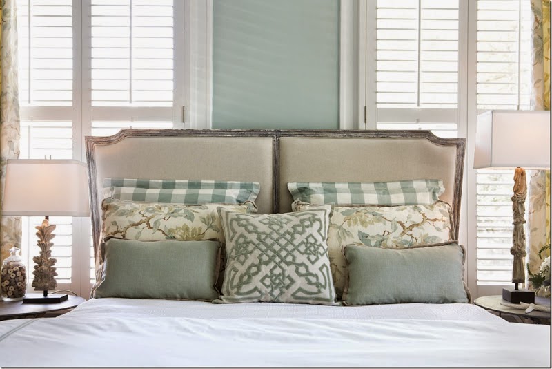
but they still feel modern

crisp

clean

sleep inducing


this is not your mother's room...

When using these soothing colors in a bedroom,

remember to bring in some contrast - in darker fabric

in reflective shine

and you can deepen that soothing color for a little drama
okay, maybe not a bedroom - but I love this color!
********************************************************
Please can you help!! I have been through a million tester pots and nothing seems quite right to go with our carpet. The carpet is called 'Cameo'. It's a pain because it seems to change color every time you look at it! Cameo carpet seems to have pinky, beige, tan and cream in it.


I am looking for a warm gray. We have already painted everything in Ben Moore natural linen and Ben Moore Finnie but both look really green against the carpet so has to be repainted. Please help as I don't want to make another expensive mistake...the painter is waiting on me to decide!!!
I'm afraid I've kept you waiting - but the nature of my business is such that I can't always get to the reader's questions as quickly as I would like. Gotta pay the bills ... I take care of my clients first - both long distance e-clients and local clients. Sometimes that makes you wait a while for an answer - especially when life sits up and smacks you a couple of times to add to the drama - so I hope that this information is still useful to you.
You need a gray without the green undertone. Undertones are sneaky little beasts that are often hard to see, especially in the paint store's fluorescent lighting. With the peachy, pinky, beige of your cameo colored rug, you need a good cool toned gray on your walls.
You should also put your sample color on a poster board with a good 2-inch white margin around the edge to stop the influence of the current wall color from effecting your sample. It will also allow you to move it to your carpet to see how it reacts.
Here are a couple of colors for you to try that don't have a green undertone... but try a sample first - colors react to too many factors to rely on a photograph..

Martha Stewart - Newsprint
Very light
(great with peaches and pinks and beige)

Benjamin Moore Belmont Gray
 |
| Benjamin Moore - Arctic Gray |
 |
| Ashwood - Benjamin Moore |
 |
| Classic Gray - Benjamin Moore |
Hello,
My living room is gray owl which I love, and I am trying to decide what color to paint the adjacent dining room, which is visible from the living room. I noticed your suggestions of sea haze and another gray color on your blog, but wanted to know if you had any other suggestions that weren't gray? I do want to keep it neutral and airy though.
Thanks!
Angela
So when you say 'not gray' - do you mean real gray as in white added to black.... or one of these shades...
because nearly every color has a gray
and the grayed down tones of these colors are 100% more livable, less saturated, more soothing
more enduring over the course of the years...
hard to believe these are all grays... right?
Here are a few colors I think may look good next to Gray Owl (only a swatch on your wall in your own room and light will tell)... I will try to avoid any color that says 'gray' too strongly, but these colors are all grayed down a bit.
 |
| Benjamin Moore GRANT BEIGE |
 |
| Benjamin Moore GUILFORD GREEN |
 |
| Benjamin Moore PALLADIUM BLUE |
 |
| Benjamin Moore TRANQUILITY |
