To all my clients who have survived a remodel....
I feel your pain...
living without a kitchen....
sucks.
On the positive side...
The sink is now located under the beautiful new windows.
There is granite on my counter tops and my ceiling no longer looks like Swiss cheese.
The trench across my entire kitchen floor, and its corresponding piles of dirt,
has been closed, cemented and covered .
I have new french doors to the patio and a fresh coat of paint on the walls.
Progress is wonderful!
Through this renovation, I've learned a few things...
.
it's probably a bad idea to send ALL of your furniture out to be reupholstered all at once...
and leave nothing to sit on - (yes indeedy I did)
If you are getting a new range/oven - it might be a good idea to invest in a small counter microwave or a toaster oven if you don't have one....and don't pack the crockpot away...
Even if they tell you it will only be a few weeks without a kitchen... It will be longer.
much longer...
It is actually possible to get tired of eating out...
'Magical Thinking'...is believing you can keep the rest of the house clean...
Because there is dust.
Everywhere.
Every day.
A new fine film of dust....
Even behind doors in areas there is no construction..
Even living in a plastic walled cocoon.
But today is a good day, because we are what seems minutes away
from actually moving everything back in and using the kitchen...
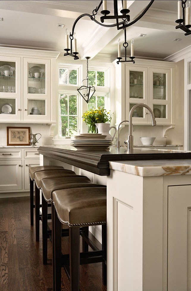
The cabinets are installed in all their soft white glory -
no longer looking like packages waiting to be unwrapped in my garage.
The hardware just punctuates their beauty - bronze pulls from Restoration hardware -
[happily they were having a great sale on their gorgeous hardware ... ]
The faucet, dishwasher, ovens and cooktop have been installed,
and beautiful!
My outlet with USB plug-ins ROCKS!
I adore my kitchen windows...
and my new, deep, sink.
the island granite (a mistake) has been replaced
.JPG)
with this warm wonderful
walnut butcher block... (what I actually ordered)
The painting has been completed throughout.. except for the trim..
and new hardwood flooring warms the room
With any home improvement or remodel there are problems that arise.
Some are mistakes.
Some are unanticipated problems that need to be resolved.
The grate for the new cooktop came out of its box broken. The replacement came quickly.
I had a moment of panic when they sent me the wrong oven/microwave - but it was quickly remedied. [Thank heavens for Lanny at Pacific Sales who was kind and professional and made everything perfect.] Since we moved the sink there was an issue with the vent pipe -
it ended up jutting out of my wall at ceiling height.
It is too large to be hidden by the crown molding.
But I love a challenge and have come up with a solution....
You will just have to wait and see...
The light fixtures - lets just say they didn't do a thing for the room...
They weren't broken, they just didn't look the way I wanted.
Restoration Hardware didn't bat an eye when I wanted to just change the clear glass shades
to the black metal shades.
They weren't broken, they just didn't look the way I wanted.
Restoration Hardware didn't bat an eye when I wanted to just change the clear glass shades
to the black metal shades.
It made a huge difference and I'm so happy with them.
The only remaining items are the little finishing touches
Was it worth it?
Ask me when I'm all moved in and the final inspection has been done....
Ask me when I'm all moved in and the final inspection has been done....
No, on second thought I actually can answer that now.
I walk into this space and see what an incredible change moving a wall and reworking the kitchen space has made and I can tell you it is well worth every take out meal and inch of dust... it feels amazing.
Mr. B was surprised how big a difference bumping that back wall out just 3-4 feet could open up the space.
It seems such a lot of work for such a little extension,
but truth is, we could not have created this kitchen without that extension.
It made everything work.
Did I say problems arise?
My pedestal sink was a casualty while they were removing the tile floor in my powder room
A new sink required a new faucet. (Of course)..
And while we are at it, we need a new light fixture and how about some wainscote?
It's like a little snowball going downhill and getting bigger and bigger....
Bye for now...
*****************************************
QUESTIONS FROM READERS
Hi Claudine,

I love your website and have found it very helpful! I am facing a design dilemma as I am remodeling my kitchen, and was hoping you would be so kind as to give me some of your input.  My cabinets will be white, and my countertops will be black Quartz.  I will do a simple white subway glass tile backsplash.  My Kitchen is only 10 x 15, and I am looking for floor tile and paint color, and I'm totally confused.  I have been using the Sherwin-Williams color palette similar to the Benjamin Moore palettes you have been discussing.  Colors are variations of Greige, slate gray, and khakis.  I originally was looking at hardwood floor, but the kitchen butts up to original red Oak flooring in the rest of the house, and it didn't look right.  I will have a new brushed metal and glass table with a frosted green glass top.  My question is this--will a darker gray/Greige floor tile look better than a light one, and what colors should I do on the walls?  Should they be the same tone as the floor?  I want to keep within the same palette I have been using, and notice that you said Gray Horse goes well with blue and green tones.  Will all of this work in the black-and-white scheme?  I know it's hard to answer these questions without pictures, but at this point pictures won't help --nothing has been done yet.  Any help at all would be so much appreciated!!  Many thanks,
Audrey
Hi Audrey:
I would go darker on the floor as opposed to lighter if you are using a stone or tile. A gray will look nice next to the red oak flooring, as well. I would choose a dark to medium flooring in the gray tones, and then find a paint color that compliments the flooring. Its much easier to find a paint color to match a floor than vice versa. Pulling in Gray Horse could be lovely.
 |
| BM Gray Horse |
A greige (gray beige) may also be nice and add some warmth to the black and white color scheme, (my favorite from Sherwin Williams is Accessible Beige) and yes it will work - t
 |
| SW Accessible Beige |
hese are all neutrals and will look good with your palette. So find your flooring first, and then pull some swatches from the amazing selection of grays and grieges in the Sherwin Williams paint palette to find one that will look nice with the floor. Your cabinets and counter top will go with anything - its tying it to the rest of your house that will be more challenging - but with your palette not as hard as you think! Good luck!
************************************
I have an open floor plan and just painted it Zen Pebble by Valspar. I am looking for a transition color that goes into the second level walls and staircase. Any ideas would be wonderful. Thank you. Amy
Amy,
Valspar's Zen Pebble is a nice gray with a lot of light or luminescence - but I'm not completely sure about your question. Do you need a color for the second level walls and staircase? Or do you just need a color leading up to that area and are they already painted - and if so what is that color? So - I will assume for the pupose of answering this post that you need the actual color to go up the stairs and the second level walls.... My first choice would be to carry the Zen Pebble upstairs. It carries a lot of light and would be perfect for a staircase. Secondly - maybe adding a little blue or green or beige to the gray tone of the Zen Pebble would make a nice transition - like Quill or White Pistachio.
 |
| Valspar WHITE PISTACHIO |
 |
| Olympic QUILL |
.JPG)
.JPG)
.JPG)
.JPG)
.JPG)
.JPG)
.JPG)
.JPG)
.JPG)
.JPG)

.JPG)
.JPG)
.JPG)

.JPG)


