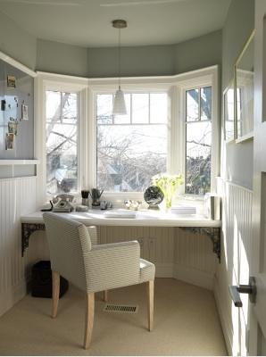
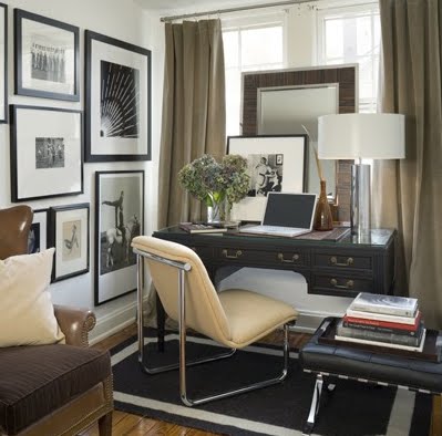
EXPLORING COLOR
 |
| Benjamin Moore BENNINGTON GRAY |
ONE OF THE FIRST STEPS IN DECORATING YOUR HOME
IS CHOOSING A PAINT COLOR
Decorating is always easier if you have a clear color palette in mind.
Even with an idea of what colors you want in a room, selecting paint can be a daunting task.
There are literally thousands of colors to choose from, and even if you have a general idea what you will be using in your decor, wall color is difficult.
With that in mind, here are some tips to help make it a little bit easier:
DO: CHOOSE A NEUTRAL COLOR FOR YOUR WALLS
 |
Kylie M Interiors
[Benjamin Moore GRAY OWL] |
I'm not talking beige or tan here. Neutrals are not limited to whites, tans, browns, grays and beiges.
Nearly every color can be a neutral - It will be the muted down or grayed down version of that color, but that is actually the best version to have on your walls. It will enhance but not overpower the rest of your decor.
Your wall color should not be the first thing you see when you enter a room - it should all pull together as one balanced look. If your guests say, "Wow, now that's a wall color".... you've missed the mark. They should be saying, "What a beautiful room!..".
DO: TRY YOUR COLORS OUT BEFORE PAINTING
Paint some samples of the colors you are considering.
Instead of painting samples on your walls, paint two coats (letting it dry between coats) on poster board or foam core board. Leave a 2" white border around the sample, otherwise the current color on the wall may influence how you see the new color. This allows you to tack the poster board to your wall and move the board around the room to see it in different lighting.
Paint often has hidden undertones that may not be immediately visible. That's important, because wall color is affected by light, and the light in your home is different from the light in anyone else's home. Light changes throughout the day with the position of the sun and there is artificial light in the evening that differs with wattage and the type of light. Natural light is also influenced by the direction your room faces and sometimes with the vegetation in your yard. You may find that soft sage green that looked lovely in the paint store turns into pea soup in your home's evening light. So live with your samples for a day or two - and see if it is a color you love.
 |
| Accessible Beige - Sherwin Williams |
DON'T: LET COLOR INTIMIDATE YOU
Paint is the easiest and least expensive design element to change.
Don't stress over wall color - if it doesn't turn out as hoped, just repaint.
Neutral
Benjamin Moore's color palette is truly exceptional. (
Pottery Barn also uses their paint for the catalog).
Sherwin Williams has a great selection of grays, cool beiges and grayed down greens and blues. In face, gray is not limited to the lighter version of black you grew up with. Today's gray includes a full spectrum of color and intensity and looks beautiful paired with your favorite color.
Gray looks wonderful with silver, and surpisingly just as elegant with gold.

It is beautiful paired with cream or crisp white
Gray doesn't overpower or fight with other colors. It is the perfect well-behaved neutral. It is perfect with warm tones.
It warms up with burnt orange or pumpkin
One of my favorite combinations is a soothing gray beige with cream and tan
A calm gray beige with white is a perfect palette for a soothing nursery
Gray-blue creates a cool, clean classic with white and chrome/silver
Fabric and Upholstery take on the gray tones in this design by
Candice Olson
Darker greys create a more masculine atmosphere
and a more dramatic design
a combination of gray and tobacco with darker woods -
proof that gray works with nearly every color and wood tone
soft gray painted cabinets
Gray and white - a classic look
beautiful layers - light gray walls with deeper upholstery and rich wood tones
 |
Centsational Girl
Benjamin Moore TRANQUILITY |
paired with cream again - I'm liking this!

this soft gray with lavender is beautiful, airy and feminine
Gray-greens sooth and calm - and look striking with white molding
Gray beige is often called Griege.
Since warm colors move toward you, they often make a room feel smaller or cozier. A cooler color will feel more calm and expand the feeling of the room. Beige is generally a warmer color - but when it is grayed down to a 'greige' is becomes a cool color.

Gray is a perfect cameleon - cool on its own - when paired with warmer colors it allows them to shine
there is nothing 'cool' about this room..
tell me you love the ledge behind the bed and the giant mirror as headboard that adds light and dimension to this room. that's creating brilliant magic, baby!
the pale gold with that beiges-gray (greige) - poetry

Taupe is basically grayed-down brown or tan.
tan is the perfect compliment to this silver blue room
white washed (gray washed) woods
Like an overcast day, gray enhances the other colors around it.
I hope you have enjoyed exploring gray with me.