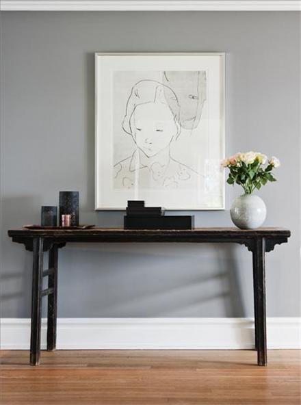
EVEN IN A DROUGHT
Something I have found to be an interesting truth...
not everyone thinks they deserve to have a beautiful home.
Some people believe they have the right to remain - mediocre
Some people believe they have the right to remain - mediocre
Its something I struggle to understand.
Even if I felt that I was somehow unworthy of a pretty place to live,
I would believe with all my heart that my boys deserved a lovely home
and I would do my best to create that for them.
Even if I felt that I was somehow unworthy of a pretty place to live,
I would believe with all my heart that my boys deserved a lovely home
and I would do my best to create that for them.
Some beauty you create
and
and
then again, some places in this world are just naturally beautiful.
Norway, for example
 |
| via |
 |
| via Pinterest |
My boy took a little trip there this year -
 |
| via Pinterest |
It was quite an adventure. From the photos he took, I'm convinced its one of the beautiful places... Norway
and New Zealand.
 |
| via Pinterest |
I can't think of a single inch of NZ that isn't beautiful.

via Pinterest
I had the great privilege of living and working in this lovely country
for a few years....
 |
| via Pinterest |
 |
 |
Those not privileged to live there, have to travel to experience that much beauty....
or attempt to create a little piece of Eden on our own.
 I have been trying to do that in my yard in the midst of a drought...
talk about a losing battle.
Today I noticed all the brown patches on the front patch of lawn had been torn up -
creating even more brown ugliness -
we think raccoons are to blame.
They made quite a mess of things.
 California is well into several years of drought and requiring water cutbacks.
As I watch the grass grow browner and browner
and the potted plants droop and die where flowers used to bloom...
I realize Eden doesn't always work out as planned.
 The lush garden of my dreams will have to wait until the drought ends.
 For now, we will tidy, seek drought friendly alternatives,
live with brown grass, and pray for rain.
Here are some tips for curb appeal in the midst of a drought...

talk about a losing battle.
Today I noticed all the brown patches on the front patch of lawn had been torn up -
creating even more brown ugliness -
we think raccoons are to blame.
They made quite a mess of things.

As I watch the grass grow browner and browner
and the potted plants droop and die where flowers used to bloom...
I realize Eden doesn't always work out as planned.


live with brown grass, and pray for rain.
1. Shrubs require less water than grass.
Lawns need lots of water. Shrubs require much less.


Plant drought tolerant shrubs and plants

You will be surprised which plants are hardy and can handle less water.

Perennials tend be more drought tolerant than annuals, but there are some annuals that will be able to handle less water. Check with your local nursery for native plants and drought tolerant annuals and perennials.

This colorful border (above) is also drought tolerant.
2. Add a little more hardscape
Who could resist this little seating area in a corner of their garden?


Pavers are engineered so that water is able to go through to the soil beneath and back into the ground waters below. A dry creek serves the same purpose and can add a focal point.

3. Replace the Lawn


Trailing Rosemary (below) - also drought tolerant

So, create your Eden. Just make it more drought friendly!
************----------------*************
ANSWERS TO READERS QUESTIONS
Hi Claudine, I stumbled upon your blog and other sites while searching Pinterest for color ideas for my home. I was recently given a code violation by the City of Baltimore for peeling paint on my house and have been given 30 days to get it taken care of or face some hefty fines. I have spent most of my morning today admiring your blogs/websites and see that you have offered others suggestions for paint colors. This is a photo of my house and I would be so grateful if you could help me or point me in the right direction for colors that would complement the brick.

I have been admiring a house not too far from me that has been painted SW Outerspace (it looks dark blue/grey in the sun) with white trim, not sure if it would be too dark with the brick.
 |
| Sherwin Williams OUTERSPACE |
It is not brick but some sort of siding so the entire house is that color. I think I would like something in the blue/grey or even colonial blue family but am open to any pallet or suggestions from someone who does this for a living. I look forward to any ideas that might have. Thanks, Joan.
Hi Joan! You've hit on a good color to go with the reddish brick on your home. A nice cool tone is a good compliment. The blue/gray color family as well as the gray color family would be good choices for your brick. I don't think Outerspace would be too strong a color, but it may make your home look small. Sometimes intense deep colors can do that. Here are some alternatives. I'm also throwing in a gray or two.
 |
| Benjamin Moore BLUE NOTE |
This may be a better choice for your home. Not as intense. See the reddish brick on the foundation and how they compliment each other. |
| Benjamin Moore MINERAL ALLOY |
 |
| Sherwin Williams SLATE TILE |
There is a little of the red brick on this next picture to help you picture the color next to it.
 |
| Sherwin Williams GRANITE PEAK |
 |
| Sherwin Williams STORM CLOUD |
I would definitely keep the white trim, and I'd add a distinct door color so that the white trim pops and the door says 'welcome'!
Good luck!
Hi!
I am attaching a picture of my home that we will be painting soon. I have
tried Several colors and we are having a hard time deciding on a good base
color, but we know we will be using a lighter color for the trim and off-black
Shutters. We want to stay away from anything with pink, flesh tones.

Here is my question: Can you suggest a Sherwin Williams color (or colors)
you would use to make the house look better and tie in the stone, front door
and Roof better?

I am desperate at this point.
Thank you so much!
Laura
Marietta, Georgia
Laura, to dispel the pinky fleshy tones - find a color with a gray undertone - which will also be the perfect tones to tie in the stone and roof colors.
 |
| Benjamin Moore VALLEY FORGE TAN |

 |
| Sherwin Williams DORIAN GRAY |
 |
| Sherwin Williams COPLEY GRAY |

 |
| Benjamin Moore ROCKPORT GRAY |


A lighter color would make the stone stand out more.

Darker hues will make it blend in more.

Choose 2 or 3 of these to paint onto white foam core board and carry them outside to see how they look in the sunlight, and next to the stone, etc.
 |
| Benjamin Moore GRAY HUSKIE |
 |
| Benjamin Moore CHELSEA GRAY |
 |
| Benjamin Moore COPLEY GRAY |
GOOD LUCK!