It is important in creating a lasting beautiful design to clear your mind of the trends of the day
and meditate a little on the things that really make you happy and the colors that you find comforting.
Don't get caught up in a passing fancy that you grow tired of a few months down the road.
Don't get caught up in a passing fancy that you grow tired of a few months down the road.

I am still surprised to find that many of my clients don't recognize they have a style all their own.

Your home carries your spirit and your personality
and so its essential that you know what delights and inspires you.
 |
| Centsational Girl |
If you love a bright color, don't be afraid to say so.
We should live with the colors we love.
You may not want it on your walls, but you can live with it in accents throughout your room
or perhaps, if it is possible, a grayed down version on your walls.

Because graying down a color makes neutral, soothing and extremely livable.
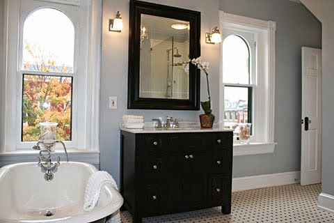
Like these gray greens by Benjamin Moore


Walls, after all, should be backdrops to the lovely furnishings of your home.
Walls should be quiet friends, applauding in the background
they should support your design, not detract

So, I always feel walls should be subtle
Soft
Beautiful

Here are some beautiful subtle colors by Benjamin Moore to try:

they are all neutrals and will be lovely backgrounds to your more vibrant pops of color


Wall colors don't necessarily have to be light ...
they can be dark and dreamy

as long as they are a grayed down tone,
they will be a beautiful background

So if you love turquoise, or aqua, or lemon yellow, or hot pink...
Live with it - but be smart about it...
Don't let it shout in your house - subdue it a little
let it pop out in accents....
and be soft and subtle on your walls.
QUESTION FROM A READER:
Hi Claudine,
I came across your blog and love it! (and all of your suggestions/tips!)
I bought a house last year and have been avoiding painting my kitchen cabinets because of all of the work that goes into it...but as you can see from the picture the dark wood cabinets have got to go!
q.jpg)
I painted the kitchen walls Benjamin Moore's Cape Hatteras Sand and am looking for a kitchen cabinet color.

Cape Hatteras Sand - wall color
Benjamin Moore
Since my floors are white, I wanted to do a pop of color, green I was thinking. But, not sure what color!? Do I stay in the same gray/green color or go with more of a light pop of green?
Thanks so much, and looking forward to hearing back from you! Erin Marx
 Hi Erin,
For something as permanent as a cabinet color - I would recommend the longer lived, more livable and neutral grayed down color. However, that being said, I completely love the kitchen above, with the fabulous green and white palette in bolder, deeper colors. (It is still a slightly grayed down version of teal - so maybe that is why). Generally, I recommend keeping your pops of color to your accessories, fabrics and other accents. That comes from my own desire to not have to repeat the whole cabinet painting experience every 10 years or so... So, be realistic. If you crave color - go for it. If you want a pop of color - think neutral. You need to go by what you are willing to do - and not let the magazine photographs seduce you...

Cabinets take a lot of work to paint. Sanding and painting, repeated several times. You may not want to redo that process, or the cost involved if you have it done professionally, when your color becomes outdated a few years down the road. Which is why I recommend going with a neutral for cabinets.


For something as permanent as a cabinet color - I would recommend the longer lived, more livable and neutral grayed down color. However, that being said, I completely love the kitchen above, with the fabulous green and white palette in bolder, deeper colors. (It is still a slightly grayed down version of teal - so maybe that is why). Generally, I recommend keeping your pops of color to your accessories, fabrics and other accents. That comes from my own desire to not have to repeat the whole cabinet painting experience every 10 years or so... So, be realistic. If you crave color - go for it. If you want a pop of color - think neutral. You need to go by what you are willing to do - and not let the magazine photographs seduce you...
If you still want a little more color - consider painting the island a fun pop of color
Otherwise, fresh green can be added to a neutral kitchen to make it pop in accessories and possibly a colorful backsplash.
Here are some examples. Good luck!