9/1/14

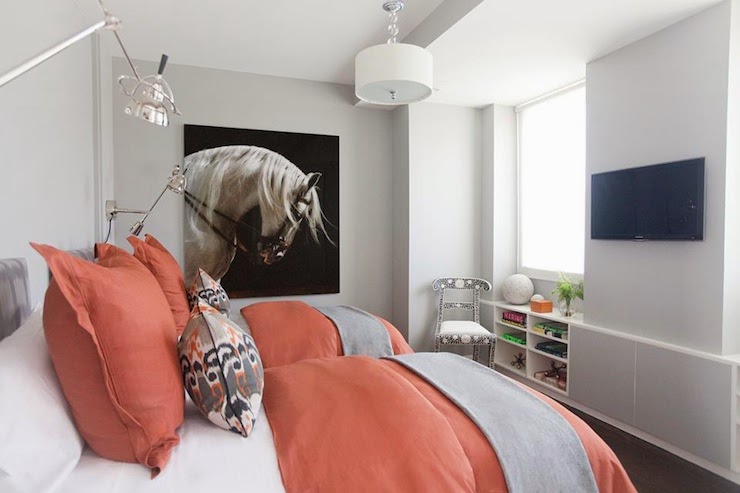
THIS IS HALLOWEEN - ( AND XIMENA'S HOUSE COLORS)

END OF SUMMER - ALREADY?

Mr B and I were talking about our Summer.  Actually he said "What Summer?" - and it's true
it has completely escaped us this year...
It started with the slab leaks (2 of them)
waaaaay back in November of 2013.
With the flooring already torn up, the second one did little damage
more inconvenience than anything
but it delayed us so completely that the architect had to make revisions to the plans...
new laws...
and now the contractor is delayed because he had to take another job in the interim...

Then in June in the middle of doing a wedding for the most darling couple (can't wait to see the photos)
I ended up in the hospital with blood clot
kinda scary...
Mr. B. won't let me out of his sight - (like if he can see me, then nothing bad can happen...adorable)
but in all seriousness recovery is taking a lot longer than I ever realized...


Then my dear, sweet, 97 year old mother passed away
and the funeral will officially end our Summer.

If I can quote Mr. B again, "I don't ever want to repeat this Summer!"
Ever.
Yeah.

On a good note...
My son graduated college, AND started a new fabulous job in the Bay area.
So proud of him!

I needed a distraction, so I
hobbled through Rogers Gardens Halloween display.

RG can pick up my spirits any time of the year, 
but seeing their Halloween display is one of my favorites.  
Don't expect to see stuff lined up on shelves like Target or Michaels -
at Rogers Gardens, Halloween retail is theater.
[I took way too many photographs...
so, I'm breaking them up into two posts ]

PART I

There is always a theme - this year it is "Hauntingly Beautiful"
It was full of gold damask draperies and accents
and lots of skulls... so fun! 

 the chandeliers and spot lighting set everything aglow
( I love skellies and skulls at Halloween!)
It's impossible to see everything in one trip.

My dress form, Matilda, needs some of these...

Super cute paper medallions.  Matilda would love them!

The wall of transforming photographs - where they go from normal to creepy - was pretty cool  
especially if you walk from left to right in front of them and watch them all turn into monsters...
the whole wall of them....
(wanted to take the clock home, but didn't think I could sneak it out in my purse..)

These would look adorable on the front porch, lighted at night. 

Folk artist Vergie Lightfoot, creates these cute creepy pumpkins with the realistic eyes....
 but at this boutique, it was the skellies and skulls that ruled
softly lit by dozens of chandeliers
glittering pumpkins, crystal cobwebs, and even sparkling rats...


Gotta get me some of those glasses!


Halloween will be chaos at my house this year.
Inside will be a construction zone.
so the plan is to just decorate the front door, patio and walkway.

I have 3 new skellies still tucked in their boxes that I'd love to use somewhere
plus the cutie I found at RG...(show you my treasure in the next post)
stay tuned for more photos....


I still want to find a little 2-3 foot articulated skeleton so I can make this wreath...
I think I need it for my door..

or maybe just a skull and a few bones will do?


*******************************************************

QUESTION FROM A READER:
Would you be able to help me by giving me ideas of colors to paint the exterior of my house? I am a single mom and I started  to save money to paint it. When I bought it in 2011 I knew it would need to be painted  soon. 

Thank you very much.
Ximena Fernandez
Bend, Oregon

Ximena,
I think we need to make a good contrast color statement on this home, because the beige isn't doing a thing for it, right now.  Its a little to 'fleshy' looking.  I'd go with a grayed down color - or a gray - and provide plenty of contrast with fresh white trim which will brighten and lift your home - especially around the windows - reflecting a little more light inside.  Oregon - famous for its overcast and rainy days - needs a little more contrast in color to keep from looking bland.   Bring in a black or near black color for accents if you have them - and add a bold bright door.  Who can have the blues with a bright colored door?   Here are some color suggestions:  (I generally recommend Benjamin Moore or Sherwin Williams - but if you can't find them in your location most hardware stores can color match them.)

Try: Benjamin Moore Smoke Embers

Try: Benjamin Moore - Amherst Gray


Try: Benjamin Moore, Chelsea Gray

In the beige tones - make sure there is a healthy helping of gray so that it doesn't turn fleshy looking, and maintains that calm, soothing, sophistication.
Try:  Benjamin Moore, Hampshire Gray
(an olive green/gray)
Benjamin Moore, Bennington Gray
with Benjamin Moore, Hale Navy shutters.

Benjamin Moore, Copley Gray with
Benjamin Moore, Sea Pearl trim

Benjamin Moore, Midnight Oil with
Sherwin Williams, Dover White trim.

Now pick a door color.  One that will be cheerful even on a Pacific Northwest gray day!


Good luck!!

8/22/14

PEACH AND GRAY PALETTE


About 17 years ago my father passed away.  He's the handsome guy on the left in this late 40's photograph.
That's a real dimple in his chin, and the hat tipped a little rakishly over his eyes was a signature style, too.
That beautiful woman on the right is my sweet mother, Afton.  She was devoted to him for over 60 years.  
We lost her yesterday.

Afton was nearly 98 years old and mother to 9.  
Mom and Dad were married in the depression era, she just shy of her 17th birthday and he a robust 22 year old.  They married young in those days...
They also sewed clothing, made quilts, canned fruit, baked bread, ironed clothing, milked cows, gathered eggs and shot the occasional pheasant out the back door for dinner.  The depression and a large family made her thrifty and clever.   She had a great capacity to love, a thirst for knowledge, an appreciation of beauty and a talent for needlework and homemaking.  She gave home perms to her girls, and sewed all their clothing.  She became so good at it that she won ribbons at the county fair for her skills. 
I look at my stainless steel appliances, my gas dryer, store bought clothing and zippy little car that takes me wherever I need to go and wonder how she did it all.
When I was a teenager, she added 'teacher' to the mix .  She taught English and Social Studies at a school in Pesega, Western Samoa; just one of the many countries in which we lived.  She loved the South Pacific. She could sit all day and watch and listen to the ocean. 
 She loved to travel.  I was astonished to discover she climbed the Eiffel Tower at age 91.  

    In her last years she had begun to depart from us.  Her memory retreated to the past and we weren't always recognized.  Sweet Afton, we will miss you, but are so happy you can be reunited with Daddy, and brother Boyd who left us 7 years ago.  You live on forever in memory.  I love you Mom.


Sincere, heartfelt thanks to all of my wonderful friends, readers and family who have reached out with love, hugs, prayers and kindness.  I am touched beyond words.  


QUESTION FROM A READER:

Hi Claudine -

My husband and I are in the process of a closing on our very first home.  The main level of the home is a peachy cream color and the basement is a mint green.  At this time, we can only spare enough cash to paint one level and I chose the basement b/c it's just so horrible.  I feel like I can live with the peachiness of the main level, but I'm having the hardest time deciding on a furniture color/color scheme to match the walls. My dream would be to start over and paint the entire house in a silvery grey with some darker grey rooms/accent walls splashed in, but we can't afford that right now. 

I have attached a couple pictures of the living room and adjoining breakfast area/kitchen to get your thoughts.  The pictures are from the listing so none of the furniture/décor will remain....thank goodness! :)  I was considering a heather grey or very light taupe color living room set, but I just don't know that it would work...maybe with an area rug with a splash of peach? 


ANY help/suggestions you can provide would be greatly appreciated!!!  
Thank you.
Julie

Hi Julie,
You said your dream would be to repaint in a silvery gray palette, and I would definitely work towards that goal as you add rugs and furnishings to this area.   Try not to get stuck in the peach zone.  These rooms above are far too warm - the walls are warm, the rug is warm, the fabrics are warm the woods are warm. Results are an overheated color scheme.  Peach tones will work nicely with a medium to dark gray sofa, and you can pretty much ignore the whole peach color scheme, as it will become a neutral and a background as you add more of your gray tones and your accent colors.  When you can eventually repaint with the colors you prefer, you won't have to redecorate again.  Find a rug that has colors you love but that will also look nice with the wall color - Here's an example of what I'm trying to explain...

House Tweaking
Grays are a natural with peach and coral tones...  The cool grays look great against the warm peach and coral tones.

Be Colorful

 You can even accent with deeper coral.  It looks amazing with gray.
Find a rug you love that will look nice with the wall color,
 and the color you want to live with in the future...
Be Colorful
 Gray and peach really play nicely together...
Decoist


Escorial Design

Home Ideas

Interior Home Decor
 Peach and coral are making a huge comeback right now - mainly because grays go so well with them and it doesn't have to look like the 90's anymore...
Nieseology
 Coral and peach are always flattering to a woman's skin tones....
something else to consider...
Sally Jensen
So, you might fall in love with an 'updated' peach and gray color scheme.  I kind of love this combination!  Add some dark woods, painted finishes and deeper shades of peach (coral and russet) to the gray and you have a completely updated look.  
Good Luck!


8/14/14

40 YEAR OVERDUE KITCHEN REDO AND CARMELITAS.... YUMMM

I just peaked at Aimee's blog and she had posted these Oatmeal Carmelitas, which just happen to be one of the recipes I've wanted to try for a while - so I'm posting the link for the recipe (above).  According to Aimee, they are best warm with vanilla ice cream...
I'm convinced.... how bout you?

QUESTION FROM A READER:

Claudine,
Redecorating my kitchen after 40 years. The cabinets are a soft creamy white with hint of grey. The backsplash is cambria quartz darlington. The backsplash is shell white glazed porcelain mosaic tile, the floor is linen travertine. All appliances will be stainless steel. Light from south in front hallway, west facing kitchen window and north facing large window. Would like a paint colour to bring it all together without yellow undertones. Thanks Maura 


Maura, 
You are LONG overdue for a beautiful kitchen.  Congratulations on the redo!  So far, I think your choices are very good.  Drawing from the description of your cabinets "soft creamy white with a hint of grey" I would go to the gray side for your wall color.  Take a look at these white kitchens with gray toned walls.


I do want to caution you on allowing your kitchen to become too sterile.  Adding some warmth in the form of wood tones, baskets, greenery, etc. makes a kitchen more appealing and a place your family and friends will truly want to gather.  I posted about that very thing not too long ago here. Adding a gray tone can tip the balance either way as some grays turn very chilly and others have a warmer undertone.

In the Benjamin Moore palette, (without yellow undertones) I would look at Revere Pewter, Collingwood and Rockport Gray.   Sherwin Williams has Perfect Greige, Essential Gray and Dovetail.   Make sure you test a few to see how they perform in your specific light.


FOOD GLORIOUS FOOD... and paint glorious paint...

MEET MY FOODIE FRIEND (UPDATE)
This is Aimee.
Adorable, right?

she is my 12 year old blogger friend and a fellow foodie
who has, appropriately so, a food blog

I don't have the time to blog about food,
but I do have years of collected recipes
and then, well, there's Pinterest
my food bulletin board is huge!

oh, how will I ever get the chance to try these recipes, let alone share them?
I know,
I'll have Ms. Jones try some out for me.


She has been baking since she was 3....
she is probably better at it than me...
and she's getting darn good at photography, too...


check out one of her delicious blog posts here
(we may make this a regular feature - especially if I get to taste test!)

***************************************


QUESTIONS FROM READERS....


Hi, Claudine.
I've been sampling grey paints (BM) for the better part of a year with no luck ... working on a driftwood/beachy feel in my master. Every gray I have tried either goes beige or is too dark. The room has north and west facing windows (that are typically kept closed with matchstick blinds). Any suggestions? Right now I'm considering Gray Mirage, possibly cut 50%..... KATHY

Gray Mirage - Benjamin Moore (full strength)
Kathy,
If everything is looking too dark or turning beige, it is probably the lighting in your home.  First make sure you have adequate lighting that you can control - most of us don't - both overhead and task lighting.  

Next, look for a gray with a slight green to blue undertone - not enough to actually look green or blue, but enough to stop it from turning beige.  Gray Mirage may work for you because it has a slight green undertone.  Here are a few more to try that are both lighter in hue and lacking a beige undertone - but that still have that beachy feel:

Gray Owl, Benjamin Moore
Horizon - Benjamin Moore

Harbor Gray - Benjamin Moore
Classic Gray - Benjamin Moore
Halo - Benjamin Moore

Moonshine - Benjamin Moore

Pale Smoke - Benjamin Moore

Silver Crest - Benjamin Moore

These are all lighter and for the most part have less beige undertone in them.   Try some on the walls.
Good luck!
    
*******************

Can you recommend a white to match bottom cabinets in kendall charcoal as well as a  warmer neutral for the walls?  BM has so many paints and I want to go with a safe combination.  
Michele H

Michele,
My go to white with Benjamin Moore is White Dove.  It never turns yellow and it isn't a stark, cold white.  It looks especially nice with grays, so Kendall Charcoal should be great with it.


Try Revere Pewter on the walls.  It is a light gray with a beige undertone - it will have that warm undertone, but still be neutral and in the gray family.   

Another to try is Ashwood.  Both should go with nearly everything you throw at it!  Good luck!


Claudine


WHAT DID YOU MISS?

link within

Related Posts Plugin for WordPress, Blogger...