I'm looking forward to Fall.
I'm looking forward to cooler weather, warmer colors, gathering with family and the aroma of pies in the oven. I'm crossing my fingers that will be possible for me and for all of us in the Covid 19 pandemic.
I'm disappointed that Halloween has to be curtailed, sorry ladies .... no Halloween Party this year. The Black Hat Society is in hiatus.
(moment of sad silence)

Ok, I'm over it.
(sigh)
(I really miss you guys)
Let's talk FALL.
because masks or no masks, we are still having Turkey.

Pandemic or no pandemic, Fall is here and with it reds, golds and burnished browns, sweaters and flannel, nights with a nip in the air, spices, apples, cider, pumpkins, and family.
(Someone please tell the weather that Fall is here.... it was like 90 today. . .)

I'm all about bringing in the warm colors of Fall and nature for the season. Here are my top project picks for the season - and if you decide to do any of them I fully expect pictures!
THE FRONT PORCH/DOOR


Real pumpkins hold up pretty good outside if the weather is cool and you don't puncture the skin.
Can you actually have too many pumpkins? I think not.
A NEW WREATH
I'm really liking these dried orange wreaths for their color and I'm assuming fragrance - with oranges and cinnamon sticks - I've included a link below on
how to dry your own oranges - I was happily surprised at how simple it is -
GARLAND
I've always wanted to dry orange slices for these very awesome looks. Actually feeling a little silly for waiting so long to try it because this sounds so simple!
LAYERED DOORMAT
I do love me a cute doormat.
I like this layered look - it makes more of an impact and is so cute! What do you think?
Here are a few more...
Click on the picture for where to find them...
I LOVE ACORNS
I have no idea why I love these little nuggets - but these ideas using them in various ways add a little Fall to the home. (These are usually artificial (sometimes with real caps) but look real and are very adorable.)

Life at Cloverhill
Acorns with a battery candle (since these things are flammable) for a beautiful centerpiece

This requires a little assembly but not more than some acorn caps, hot glue and felted wool balls
or buy them pre-made here.
More wool felt balls
These adorable acorn treats! Not a decoration - unless you count topping cupcakes - but make these from mini nutter butters and hershey kisses - then hide them or they will never make it to the cupcakes.

POMANDERS
More oranges! I'm looking forward to making these - not only do they smell heavenly - they look amazing.
FABRIC PUMPKINS
I may never get to all of these projects, but I've already got a few fabric pumpkins in process.
(Its actually the only thing I've got going so far, and only because it was a project I started and didn't finish LAST year!)
I salvaged a couple of branches from a recent tree trimming and they've been drying out in the heat - I plan to use them as the stems. I wanted a more rustic look than the rolled felt stem shown below.
Mine will look more like these, I think...
I dropped by
Homeology - one of my favorite shops for home decor - and found a white chenille pumpkin like these. (Seriously, if you live in Orange County you should visit this shop).
These are everyone's favorite, but so expensive.
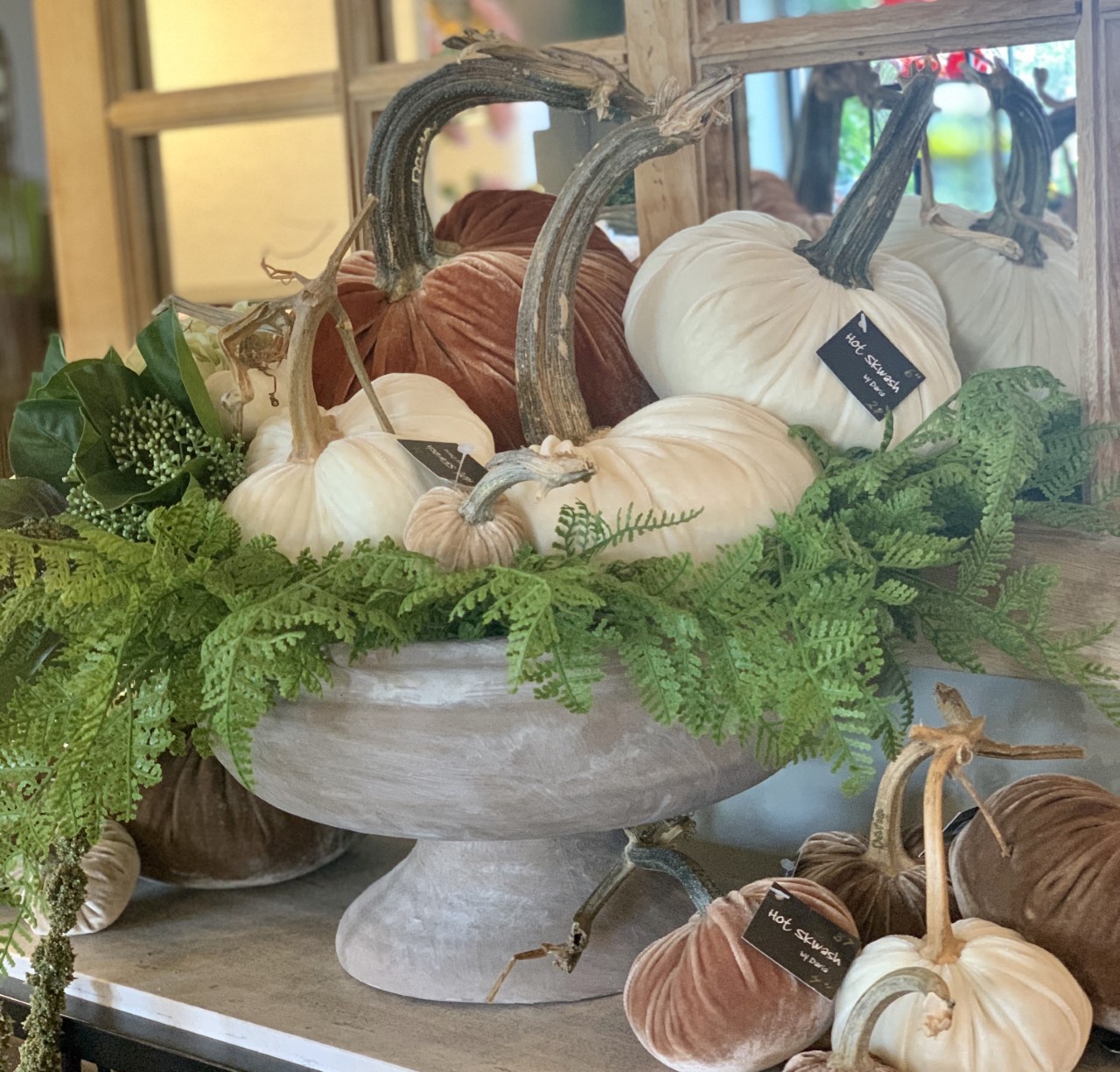
When I was in Utah, recently, I paid a visit to my other favorite shop,
Ward and Child,
and loved this arrangement with florals and velvet pumpkins -
So pretty - so now I have to go through boxes to find the few velvet pumpkins I have - and see if I can duplicate this look. I may have to find some velvet and make my own pumpkins.
Lots of Colors
NAPKIN RINGS AND PLACECARDS
The big dinner is coming up and if you are hosting, you have a lot on your plate besides delicious food. You have to dress that table, and I rarely have time for elaborate settings, so I favor these simple but elegant looks - just a little planning ahead of time - like googling where to find pheasant feathers... and how to emboss name tags...
These need no explanation - Bosc Pears and name tags - simple and elegant. (and edible)
I love these wood slice tags - buy these or make your own with a woodturning tool
Gold spray paint and a sharpie - all you need for this seasonal pacesetting
(click on picture for source)
if you don't want to try real leaves,
try these
MAKE A SIGN...
This is my favorite sign this year, because it incorporates fall colors and pumpkins!
I think I went a little overboard on the projects - I was just excited to share -
Seriously let me know if you try any and send a picture -
www.your-nest@hotmail.com
And tell me how you are doing, please!
What are your plans for Thanksgiving?


.jpg)


