Showing posts with label pillows. Show all posts

3/4/16

UPDATING A FAMILY ROOM


It seems to hit at about the 10 year mark.
Suddenly you can no longer stand the outdated colors or style of your room.

For me it was the colors -
I was so tired of the same colors everyday that I craved change.
It was almost overnight -
one day they didn't bug me, the next -
I hated them.

I think that looking at so much color all day
everyday
had me craving calm neutrals to come home to.

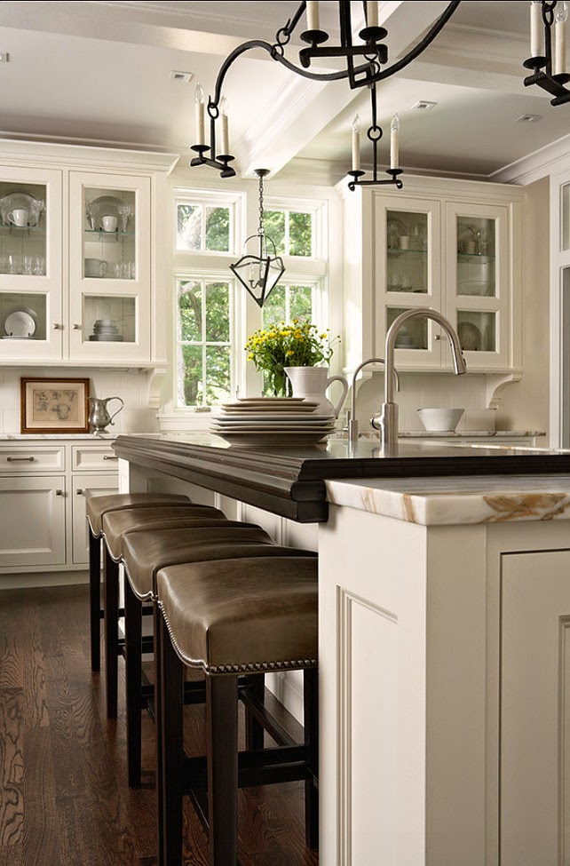
For Kathleen, it was both - she wanted to gray down her color palette
and she wanted a nice, clean-lined contemporary look.

We started with a new color palette.
Soft grays, taupes, creams, navy
and a pop of mustard
and went from this....


to this...


We used neutral fabrics with pops of color
and in another 10 years or so, when Kathleen tires of this color scheme, 
it will be easy to add new colors - simply change the accessories


The result is updated, calm, casual and inviting.  

***********************************************************
QUESTIONS FROM READERS

I'm looking for a paint color for second floor hallway. Wall to wall carpet is navy blue. Wood trim and built in wood linen closet is Benjamin Moore white wing. I'd like a color that would be good so we hang pictures on the wall.

Right now walls are white wing. There is no exterior light to the hallway, just painted white wing paneled 1900 doors to bedrooms and bathroom.

Regards,
Jan

Jan, 
Hallways can be dark spaces, so I'm recommending (sight unseen, of course) a lighter palette, but also a definite color so that the pictures you hang will have a nice background.    With navy, I recommend Sherwin Williams AMAZING GRAY or ACCESSIBLE BEIGE.   Of the two, Accessible Beige is the lighter, but in a hallway area, it will appear darker than on the paint chip. (Actually, the family room in the post above is painted Accessible Beige). It has a little more beige but is still a cool beige and will be lovely with the navy.  

Amazing Gray has more gray, is a little cooler and a little deeper color, but has a beige undertone, so again, will be nice with the navy.  

Give them both a try as a sample on some poster board you can tack in place and see which one is more appealing in your space.  Both, in a hallway, will be darker than the paint chip, but with adequate lighting will be very nice on the walls.

Best wishes,
Claudine


4/20/15

FIND YOUR PERSONAL STYLE


There are certain images that stay with you.
Pages you tear from a home decorating magazine or
images on Pinterest,
You keep coming back to them because
something about them attracts.

Studying those photos can help you discover your own personal style...

the colors 
so soft
the opposites (the formal, antique settee - with the fun contemporary pillows.
the pillows make me smile.


a little calm oasis for the eye
the odd color combination - olive and blue/green (gorgeous)
the botanicals!

high contrasts...
matte gray background
white painted built-ins
more than just books in the bookshelves...


rustic wood with shiny mercury glass
colors - tan and gray together
the contrast of the milky white against the cool gray


When you are drawn to a picture of a room, take a minute to find what you find appealing in that photo.  
You might discover what you don't like, too.
And that is nearly as important.

Do it for several photos and you may see a pattern emerge...
It may be just that easy to determine your personal style.

chunky legs on the island
the warm dark wood floors
white cabinets


details - ceiling, windows
leather counter stools with nail heads
warm woods with cool white
simple lines
non-fussy


A cozy nook with books...
linen upholstery
fur throw
blue and white - always a favorite


****************************************
QUESTIONS FROM A READER

Hi!  We just had our kitchen hallway and living room painted professionally.  I chose two Benjamin Moore colors after sampling 12 colors on the walls and finally settled on Dry Sage for the kitchen and hallway and then Greenbrier Beige in the living room.  The walls are adjacent  The painters did a beautiful job but I am in an utter panic now that it is fully painted  that the Greenbrier Beige is picking up the green from the dry sage and as a result has everything looking muttled.  I find that my eyes keep playing tricks on me and the greenbrier beige looks green vice a versa and then it all ends up looking one color or muddy and I am so worried I made a mistake. 

I'm not sure what I should do - my husband does not want to repaint but I am open to it if I was confident that the next color would be the right one.  I like both the dry sage and greenbrier beige separately but I just don't think I like them together.  I would prefer to keep the dry sage over the greenbrier beige.  We have oak cabinets in the kitchen and an oak colored laminate floor throughout and the dry sage looks great in my kitchen.  I wanted a color to compliment the dry sage - a neutral that had some warmth and personality to it and that would showcase our fireplace and white trim.  I can send pictures of the rooms if needed.  Any advice would be sincerely appreciated.  Thank you!!
Regards,
Catie 


Hi Catie,
As you can see in the pictures below, the colors you chose are very similar in value, with Dry Sage being a more dominant color than the Greenbrier Beige.  It has more warmth, and so comes toward you more, while the beige is more subdued.  


Wall color is always affected by the adjacent colors, woods, ceiling height, room size and light.  Your Greenbrier walls are being strong armed by the Dry Sage.  If the beige was a little lighter and not so close in value, they wouldn't be fighting so much.  Because they are very similar in value (strength) - your eye sees them as the same and sometimes they blend together a little.  I think this is as simple as creating more of a contrast from room to room.
You can try Manchester Tan (BM) in the beige tones


Grey Mirage (BM) in the gray hues

or go to a completely different and cooler tone with a blue
Try Quiet Moments or Sea Haze

When you do put a sample on the wall - make sure you paint it (two coats) on a poster board
with a good 2-3" margin around the edge so you can lessen the effect of the existing wall color on the new.
Pin it to the wall and observe it throughout the day in all the types of light your room experiences.
If you like it - buy it and put it on the wall!
Good Luck!


11/21/14

TYING IT TOGETHER and new wedding photos...

TRUST IS AN AMAZING THING
It allows you to join your life with another
to hold nothing back
to give freely

I loved creating this wedding because Stephanie and her daughter and bride, Brianna,
trusted me
You have no idea how fun it is to have free creative reign
and dream an event into existence...
with just a few parameters:
Lavender
Outdoors
English Garden
No mason jars or burlap.
Done.

And one more rule that is paramount in my book...
find out exactly what the bride wants
discover her style
make it her

 This wedding definitely had Brianna written all over it.

Trust and free reign means we dreamed these moments into existence


-------------------------------------------------------------------------------------------------------------------
Jason Barbiaux commented on your blog post
Our carpet is a very light brown. We are looking at furniture and one of the sectionals that we really like is pewter. What color can we paint the walls to tie those 2 together?

Gray and tan/brown is actually a good combination..  I would find a soft, lighter gray for the walls, and bring in the brown/tan in a combination of decorative pillows for the sofa.  You can add a blue or apple green to the mix if you want a little color.

WHAT DID YOU MISS?

link within

Related Posts Plugin for WordPress, Blogger...