WHY IS CHOOSING PAINT COLOR SO DIFFICULT?
Here are 8 ways to make sure you get the right color.
I hear quite often from readers how the paint color everyone is crazy about on Pinterest, or a decorating blog, turns sickly green or pink when they try it in their home. Why do those beautiful colors look so different? Well, I have a little insight into how color reacts....
1. The Paint's LRV. LRV is light reflectance value. Some paint colors absorb light. Some reflect it. Some will lighten a room because of the reflective properties. You can find a paint's LRV on the back of most paint chips. LRV is a guideline for predicting how light or dark a color will look/feel. This can help you determine if a color will be what you need - if you have a darker space - choose a higher LRV. If you have a too bright, washed out room - a lower LRV may help.
2. Not all monitors are created equal. It may look great on the computer screen, but that is not an accurate representation of the color. Everyone's computer monitor, phone, ipad, etc. is configured differently. You can start there, but never take a color at face value from a computer screen. Not only do you have to factor in the monitor differences, but also the photograph itself - the time it was taken, the light it was taken in, the settings on the camera - you get the picture.... The picture is probably not an accurate depiction of the paint color. Always. Always. Always... try a sample in your own space.
3. Big expanse: Wall color is a rather big plane of color. Multiply that by 4 walls, and you have 4 large planes of color that will bounce off one another. A tiny chip doesn't prepare you for the feeling of being submerged in that hue. You may not see the undertones in that small chip, but you can't help but see it on a floor to ceiling format.
4. Room Size: It's a factor. In a small room, especially, the wall color will intensify once it is covering all 4 walls. If you are painting a small room - like a powder room or bath - consider going a shade lighter if you want to keep the color you see on the chip. Lower ceilings will make walls appear darker than higher ceilings. Larger rooms won't affect color as much as smaller, etc....
5. Available Light: There is warm light and cool light and it comes in LED, hallogen, fluorescent and incandescent bulbs. Incandescent and hallogen lighting have a warm aspect. They warm up colors. LED can be cool or warm, depending on which is chosen. Fluorescents are generally cool, and colors will appear faded or muted - except for the more expensive full-spectrum fluorescents.
Color is affected by a lot of light and also by not enough light. All are factors in how you will see the color on your walls. Make sure you have enough lighting. (Most people don't). Make sure you have the right type of light - cool light looks cold and brings out the silvery, blue, green tones. Warm light makes whites more creamy and grays less cold and intensifies yellows and reds. Ceiling lighting (downlights) are great for work surfaces and general lighting, but you should also have lamps to fill out the corners. Remember that the shade on a table lamp can change the color and strength of the light bulb.
6. Natural Light: As if there weren't enough factors confusing your color search, you have to also contend with natural light. Color is affected by which direction your light comes from. North light is cool and can wash color out turn it gray and bring out the blues. Southern Exposure is the most intense, giving a very warm light all day. East light gets first light of day which is brightest. West gets end of day muted light - colors will appear deeper and more dramatic. Light also changes throughout the day as it moves from one side to the next, and affects wall color as it moves and changes so make sure you view your sample at different times of the day.
Here is a chart from Sherwin Williams that better explains natural light and how it affects your color palette:
8. Existing decor: And yes, the current wall color may be throwing off your color choice because its affecting the sample you put on the wall. The wood tones, or the fabric or the red brick wall or carpet color can all affect wall color, so make sure you look at the sample with a good border of white around the edge to keep the current color from affecting the new.
To sum things up, there are far too many factors to ever buy a paint color without first trying a sample. And not just a small sample - a good sized sample on poster board that you can move around the room and observe in morning light to evening light and on into artificial light. Pinterest boards may swear that a certain paint color is 'the perfect color', and that may well be the case in their home, and in their light. While these factors may help - selecting color is basically guesswork. These factors we've discussed are a good place to start - but make sure you try before you buy.
Letter from a reader:


Here are 8 ways to make sure you get the right color.
I hear quite often from readers how the paint color everyone is crazy about on Pinterest, or a decorating blog, turns sickly green or pink when they try it in their home. Why do those beautiful colors look so different? Well, I have a little insight into how color reacts....
 |
2. Not all monitors are created equal. It may look great on the computer screen, but that is not an accurate representation of the color. Everyone's computer monitor, phone, ipad, etc. is configured differently. You can start there, but never take a color at face value from a computer screen. Not only do you have to factor in the monitor differences, but also the photograph itself - the time it was taken, the light it was taken in, the settings on the camera - you get the picture.... The picture is probably not an accurate depiction of the paint color. Always. Always. Always... try a sample in your own space.
 |
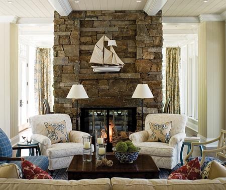
| Blesser House |
4. Room Size: It's a factor. In a small room, especially, the wall color will intensify once it is covering all 4 walls. If you are painting a small room - like a powder room or bath - consider going a shade lighter if you want to keep the color you see on the chip. Lower ceilings will make walls appear darker than higher ceilings. Larger rooms won't affect color as much as smaller, etc....
 |
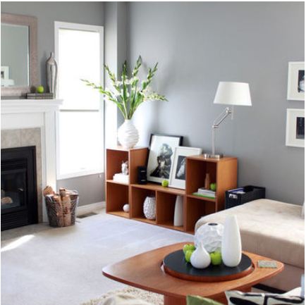
| Kylie M. Interiors |
Color is affected by a lot of light and also by not enough light. All are factors in how you will see the color on your walls. Make sure you have enough lighting. (Most people don't). Make sure you have the right type of light - cool light looks cold and brings out the silvery, blue, green tones. Warm light makes whites more creamy and grays less cold and intensifies yellows and reds. Ceiling lighting (downlights) are great for work surfaces and general lighting, but you should also have lamps to fill out the corners. Remember that the shade on a table lamp can change the color and strength of the light bulb.
 |
| Home Bunch |
Here is a chart from Sherwin Williams that better explains natural light and how it affects your color palette:
Direction
of Light
|
Visible Temperature
of Light
|
Color
of Light
|
Duration
of Light
|
| North | Cool | Bluish | All day |
| East | Warm | Yellow | Before noon |
| West | Warm | Orange-Red | After noon |
| South | Warm | Orange-yellow | All day |
7. Vegetation. If you live in an area with a lot of green trees or shrubbery close to your house, you may find you have a green cast to your wall color, or that the colors are deeper and darker than in the store.
 |
| Home Bunch |
To sum things up, there are far too many factors to ever buy a paint color without first trying a sample. And not just a small sample - a good sized sample on poster board that you can move around the room and observe in morning light to evening light and on into artificial light. Pinterest boards may swear that a certain paint color is 'the perfect color', and that may well be the case in their home, and in their light. While these factors may help - selecting color is basically guesswork. These factors we've discussed are a good place to start - but make sure you try before you buy.
***********************************************************
Letter from a reader:
Greetings!!
I came across your blog on Pinterest. We are looking for a good neutral greige to go with pretty much everything. Right now we have hunter green couches which I loathe. In the near future I hope to get either some tan, brown or gray couches.

The rest of our furniture (coffee table end tables and entertainment stand) all resembles almost a driftwood type finish. Browns grays and even some darker areas. Other accents in the home are dark brown (almost a brushed bronze and black)

Trim and doors are all poplar stained wood. Blinds are all wood as well. Carpet is a beige tan brown bur-bur
Three decent sized windows in the living room with Cathedral ceilings.
Kitchen is very country, mostly wood as well. Custom hickory cabinets. We will soon be replacing the floor with a different wood that doesn't match the cabinets exactly (too much dark wood right now). Wanting to carry the same neutral greige color from the living room into the kitchen as well to give a uniform look as well as a pretty long hallway.

Please see attached pics. Can't wait to see what you come up with. I have been in search of a good neutral paint color for years!! Don't want something too look too green. Or too blue etc

Thank you
Katrina B

Hi Katrina -
My favorite tried and true neutral paint color is a beige with a gray undertone - which qualifies it as a greige. It seems to pair well with nearly any wood tone and has enough warmth that it doesn't turn blue or green.
 |
| Houzz |
Sherwin Williams ACCESSIBLE BEIGE. It is light enough to feel cool and calm, yet has enough color to pop against whites. Give it a try!
 |
| Sherwin Williams |
If you want a little more gray in your life, Sherwin Williams AMAZING GRAY is also gorgeous, but has more gray and less beige.
Good luck!


