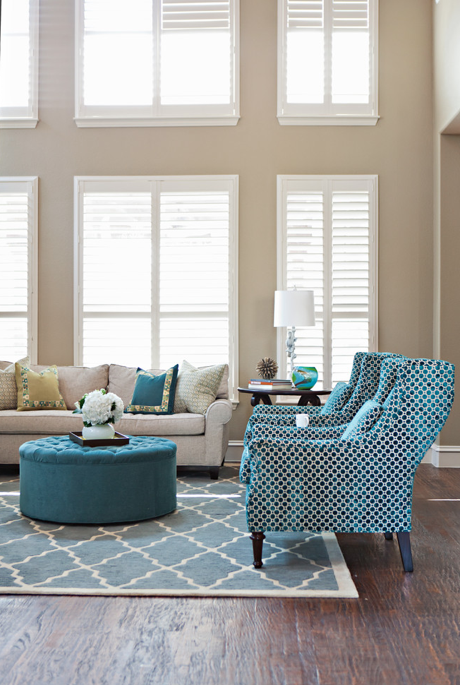
There's been a lot of talk about color for 2014.
When I hear colors thrown about, like Radiant Orchid, I have to remind myself that these are 'trends'
they are talking about. I'm not 'trendy' per se.
I like something that will stand the test of time -
which is why I like a nice neutral background so that when you get tired of that trendy color - and you will - it will take only a few changes to go on to the next trendy color or a more lasting look...
lovely neutrals with
pops of the color you love
creates a liveable palette
(you may or may not agree - and feel free to tell me so)
but it is exactly what Pottery Barn has been doing for years...
and what makes them so successful
Think of your home as a beautiful landscape painting...if the background is as bold and vibrant as the foreground
you won't have any depth, it won't draw you in to its beauty
and nothing really stands out because all the values are equal.
This is Sherwin Williams' color of the year for 2014
Exclusive Plum
beautiful
neutral
contrast that with Pantone's Radiant Orchid
definitely not a neutral...
I could probably live in this for like
5 minutes...
but this is livable...
(Sherwin Williams Exclusive Plum)
Here is Benjamin Moore's color of the year
definitely livable.
 |
| via |
Neutral doesn't mean you have to live without vibrant color
(and Radiant Orchid would fit in more as an accent color)
it just means it doesn't have to be on the walls
unless its an accent wall...
(It's wise to vary the strength of the colors you use - Two or three very strong and vibrant colors in a room
can create chaos instead of comfort...)
Neutral doesn't mean beige...
Neutral today is not boring like your grandma's neutrals...
beautiful colors, that have been taken down a notch -
for beautiful woods
So when you think of the color you want in a room - don't automatically think it has to start with wall color . Go a little more subtle in your wall choice.
grayed down to become more livable and to serve as a backdrop
for beautiful woods
for your carefully chosen furniture
for those textures and patterns you love
not to outshine them...
but to let them shine.So when you think of the color you want in a room - don't automatically think it has to start with wall color . Go a little more subtle in your wall choice.
Then add those 2014 colors they are talking about - or a few of your own -
and you still have a room you can live in
and you still have a room you can live in
QUESTION FROM A READER:
Hello Claudine
I would like to paint my living room a colour that will show off my dark brown furniture and will also go with Benjamin Moore Honeymoon which I have painted the dining room which can be seen from living room.
Would you be able to help me with some suggestions on colour.
Thank you
Pat
Pat, judging by what you have, I'd say neutrals would be your best bet to be harmonious with the Honeymoon. These colors go well with dark brown and the warm dark oak flooring because they are a little on the cool side. They allow the wood tones and the warm browns to shine.
Try out some of these:
Good Luck!
 |
| Benjamin Moore HONEYMOON |
Try out some of these:
 |
| Benjamin Moore MOUNTAIN LANE |
 |
| Benjamin Moore GRECIAN GREEN |
 |
| Benjamin Moore PALLADIAN BLUE |
 |
| Benjamin Moore SEA HAZE |
 |
| Benjamin Moore PLATINUM GRAY |


No comments:
Post a Comment
Highly intelligent comments from amazing readers...