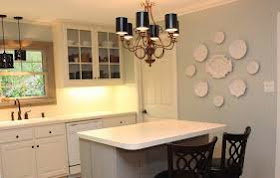
Hi Claudine,
Okay one question will be hard but here goes.
We live one block from the beach in Queens, NY, which is great, but Hurricane Sandy did a lot of damage to our home and neighborhood.
I want to update my present colors and am not worried about furnishings because my new sofa is slipcovered in light beige and the rest of the things can change.
Our home is over 100 years old and has white oak floors, which have aged in color. I believe the house style is called 4 Square. I feel after all we have been through I want more updated, sophisticated, calm, soothing colors, coastal colors.
I presently have Restoration Hardware Latte in living room with attached sunroom/den, RH Cappuccino in Hallway (which is similar to BM Berkshire Beige), BM Raspberry Truffle on the upper half of our white woodwork in dining room and RH Butter in our kitchen, which has cherry cabinets with tan brown granite, which is really black/grey with redishbrown in it. Basically looks blackish.. Backsplash is tile that is taupey and greyish in color. The floor tile 15 years old is very Tuscany in feel. Wish I had done a slate floor in hindsight. But it's a good floor and was costly with a lot of grey in it. The only color I hate to change right now is the RH Cappuccino since it is in our entranceway and all the way up to the third floor hallway. We have picture frame molding so it's a pain to paint.
Restoration Hardware - Cappuccino
I am finding myself drawn to the grey/blue/green walls in the photo above on your website. Since my rooms are not open floor plan but square archways with white molding I need help with colors. I read your explanation of how to use colors from the color chart, and while it makes sense, I find myself stuck and unable to pick colors for each of the three rooms, kitchen, living room and dining room. As for light, the kitchen gets morning light, the dining room gets a lot of southern afternoon sun, the living room is in the middle with two smallish windows flanking a fireplace so not as bright but the sunroom/tv den room attached has 7 windows, which gets a lot of afternoon western light and brings light into living room.
I asked a designer a question on Houzz last year and she recommended BM Stone Hearth for living room and sunroom, and BM Misted Green or BM Grey Horse for dining room. She didn't give me an idea of the kitchen color so that is open. While I like the taupey color, not sure if it will be too dark for living room. It's an easy color to live with and I do have concerns about getting sick of blue. It is now almost a year and I haven't painted because I don't want to make a wrong decision and keep looking at the the lovely grey/blue/greenish rooms. Would a color like BM Grey Wisp or RH Silver SAge, or BM Affinity Tranquility or SW Comfort Grey or any number of these grey blues colors work? And if so, what do I paint the other rooms??? BTW, I usually use Benjamin Moore Paint. Sorry for being so long winded, but hoping I can finally get a color palette. I am hoping you can help,
Thanks,
Denise Scandiffio
Hi Denise!
Definitely want to help you get your home exactly how you want it - in the aftermath of a destructive storm, a change is always a great way to go! As are soothing, grayed down colors for your wall.
Here are the colors you mentioned side by side so you can see them together
BM Gray Horse
BM Gray Wisp
BM Misted Green
BM Tranquility
RH Silver Sage
SW Comfort Gray
BM Stone Hearth
RH Cappuccino
I did that to show you a couple of things. First - with the exception of Stone Hearth and Cappuccino - they are all very similar - so much so that I doubt you would be able to tell which was which on the wall - and Secondly - you already know your palette. These are the colors that draw you. These are the undertones to which you are attracted. They all look lovely together. Pick 2 or 3 and Voila! - a color palette. Thirdly (is that a word?) - these are neutrals, they are soft, they have just a touch of the undertone color, they will recede and your room will appear more spacious, they will look amazing on the coast, all of your other colors will play happily with them... all good choices.
Basically, rooms with more light will lighten your walls. Less, a deeper color. Mornings will be lighter and the color will intensify in the evenings. Try a few samples on the wall and watch them throughout the day. If you like what you see, go for it.
Here are some examples of rooms with these colors, and a few you may not have considered.
 |
| BM Gray Wisp |
 |
| SW Comfort Gray |
 |
| SW Comfort Gray |
 |
| BM Misted Green |
 |
| BM Misted Green |
 |
| BM Misted Green |
 |
| BM Pale Oak |
 |
| BM Stone Hearth |
 |
| BM Stone Hearth |
 |
| BM Stone Hearth |
 |
| BM Seaspray |
 |
| BM Beach Glass |
 |
| RH Silver Sage |
 |
RH Silver Sage
RH = Restoration Hardware
SW = Sherwin Williams
BM = Benjamin Moore
In a coastal home, I love to pair these with fresh white woodwork and trim.
BM White Dove is a good companion to gray undertones.
I hope that helps. Please keep us posted on your progress! |


No comments:
Post a Comment
Highly intelligent comments from amazing readers...